4 Show the right numbers
This Chapter will continue to develop your fluency with ggplot’s central workflow, while also expanding the range of things you can do with it. One of our goals is to learn how to make new kinds of graph. This means learning some new geoms, the functions that make particular kinds of plots. But we will also get a better sense of what ggplot is doing when it draws plots, and learn more about how to write code that prepares our data to be plotted.
Code almost never works properly the first time you write it. This is the main reason that, when learning a new language, it is important to type out the exercises and follow along manually. It gives you a much better sense of how the syntax of the language works, where you’re likely to make errors, and what the computer does when that happens. Running into bugs and errors is frustrating, but it’s also an opportunity to learn a bit more. Errors can be obscure but they are usually not malicious or random. If something has gone wrong, you can find out why it happened.
In R and ggplot, errors in code can result in figures that don’t look right. We have already seen the result of one of the most common problems, when an aesthetic is mistakenly set to a constant value instead of being mapped to a variable. In this chapter we will discuss some useful features of ggplot that also commonly cause trouble. They have to do with how to tell ggplot more about the internal structure of your data (grouping), how to break up your data into pieces for a plot (faceting), and how to get ggplot to perform some calculations on or summarize your data before producing the plot (transforming). Some of these tasks are part of ggplot proper, and so we will learn more about how geoms, with the help of their associated stat functions, can act on data before plotting it. As we shall also see, while it is possible to do a lot of transformation directly in ggplot, there can be more convenient ways to approach the same task.
4.1 Colorless green data sleeps furiously
When you write ggplot code in R you are in effect trying to “say” something visually. It usually takes several iterations to say exactly what you mean. This is more than a metaphor here. The ggplot library is an implementation of the “grammar” of graphics, an idea developed by Wilkinson (2005). The grammar is a set of rules for producing graphics from data, taking pieces of data and mapping them to geometric objects (like points and lines) that have aesthetic attributes (like position, color and size), together with further rules for transforming the data if needed (e.g. to a smoothed line), adjusting scales (e.g. to a log scale),We will see some alternatives to cartesian coordinates later. and projecting the results onto a different coordinate system (usually cartesian).
A key point is that, like other rules of syntax, the grammar limits
the structure of what you can say, but it does not automatically make
what you say sensible or meaningful. It allows you to produce long
“sentences” that begin with mappings of data to visual elements and
add clauses about what sort of plot it is, how the axes are scaled,
and so on. But these sentences can easily be garbled. Sometimes your
code will not produce a plot at all because of some syntax error in R.
You will forget a + sign between geom_ functions, or lose a
parenthesis somewhere so that your function statement becomes
unbalanced. In those cases R will complain (perhaps in an opaque way)
that something has gone wrong. At other times, your code will
successfully produce a plot, but it will not look the way you expected
it to. Sometimes the results will look very weird indeed. In those
cases, the chances are you have given ggplot a series of grammatically
correct instructions that are either nonsensical in some way, or have
accidentally twisted what you meant to say. These problems often arise
when ggplot does not have quite all the information it needs in order
make your graphic say what you want it to say.
4.2 Grouped data and the “group” aesthetic
Let’s begin again with our Gapminder dataset. Imagine we wanted to
plot the trajectory of life expectancy over time for each country in
the data. We map year to x and lifeExp to y. We take a quick
look at the documentation and discover that geom_line() will draw
lines by connecting observations in order of the variable on the
x-axis, which seems right. We write our code:
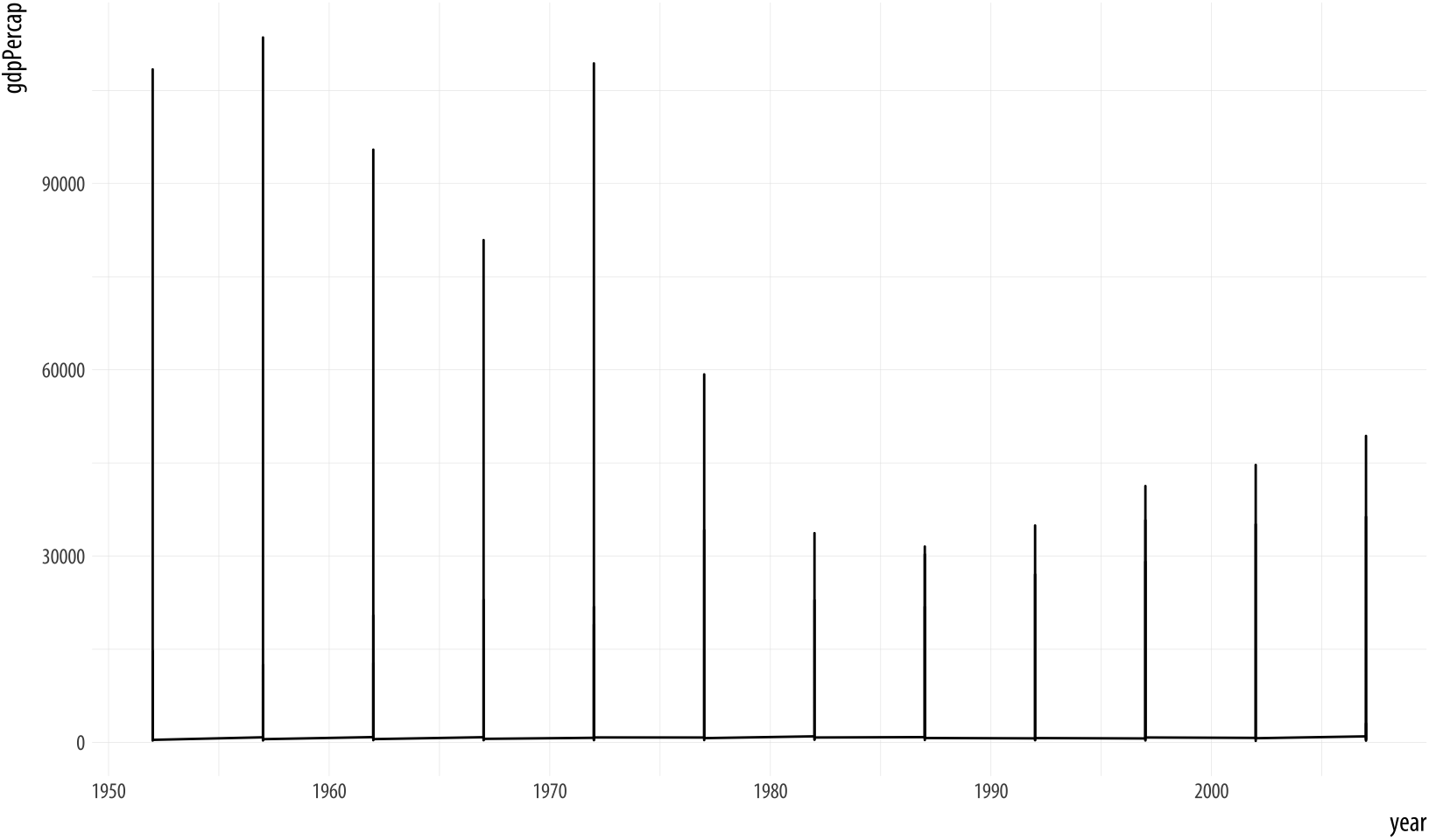 Figure 4.1: Trying to plot the data over time by country.
p <- ggplot(data = gapminder,
            mapping = aes(x = year,
                          y = gdpPercap))
p + geom_line()
Something has gone wrong. What happened? While ggplot will make a
pretty good guess as to the structure of the data, it does not know
that the yearly observations in the data are grouped by country. We
have to tell it. Because we have not, geom_line() gamely tries to
join up all the lines for each particular year in the order they
appear in the dataset, as promised. It starts with an observation for
1952 in the first row of the data. It doesn’t know this belongs to
Afghanistan. Instead of going to Afghanistan 1953, it finds there are
a series of 1952 observations, so it joins all of those up first,
alphabetically by country, all the way down to the 1952 observation
that belongs to Zimbabwe. Then it moves to the first observation in
the next year, 1957.This would have worked if there
were only one country in the dataset.
The result is meaningless when plotted. Bizarre-looking output in ggplot is common enough, because everyone works out their plots one bit at a time, and making mistakes is just a feature of puzzling out how you want the plot to look. When ggplot successfully makes a plot but the result looks insane, the reason is almost always that something has gone wrong in the mapping between the data and aesthetics for the geom being used. This is so common there’s even a Twitter account devoted to the “Accidental aRt” that results. So don’t despair!
In this case, we can use the group aesthetic to tell ggplot
explicitly about this country-level structure.
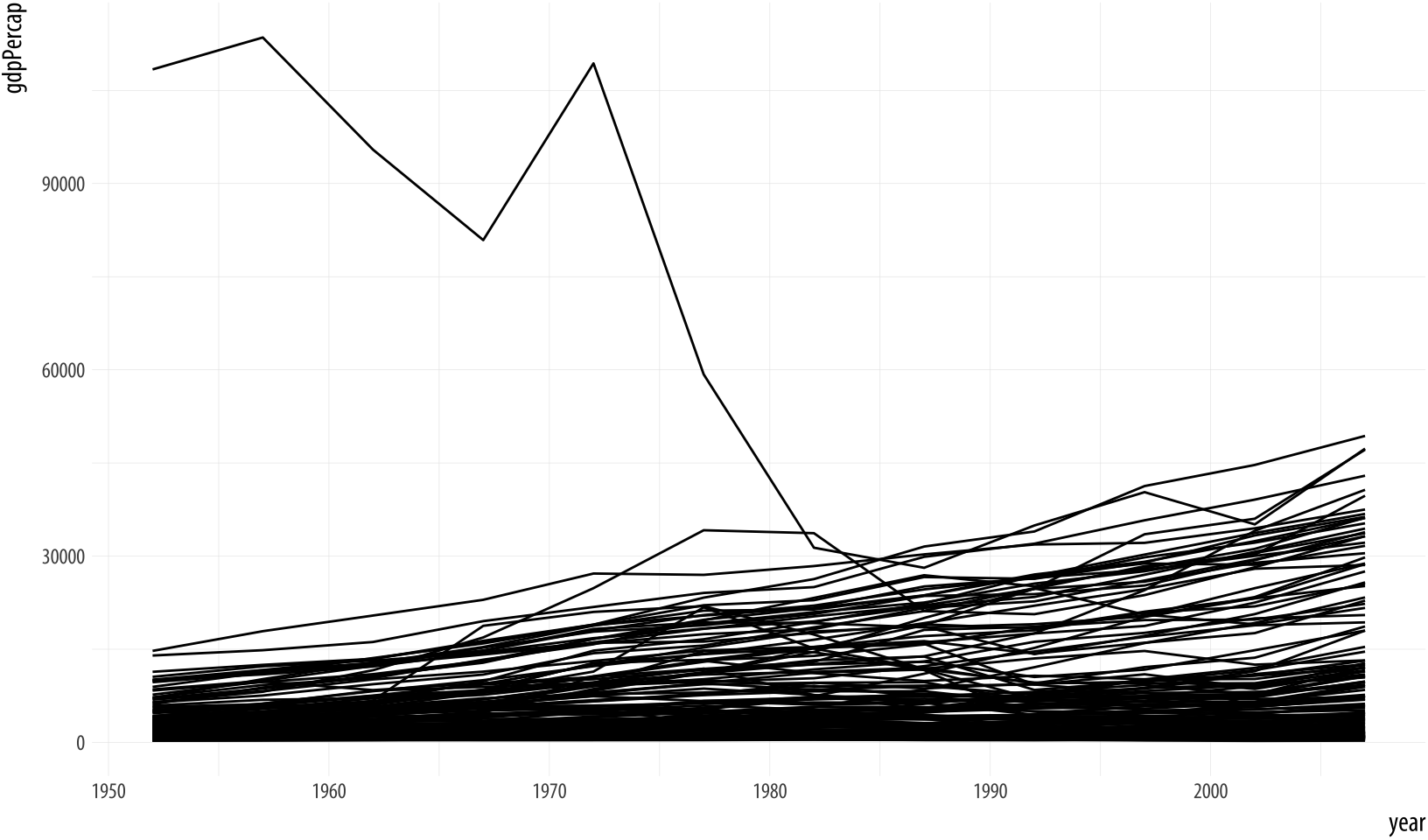 Figure 4.2: Plotting the data over time by country, again.
p <- ggplot(data = gapminder,
            mapping = aes(x = year,
                          y = gdpPercap))
p + geom_line(aes(group=country))
The plot here is still fairly rough, but it is showing the data properly, with each line representing the trajectory of a country over time. The gigantic outlier is Kuwait, in case you are interested.
The group aesthetic is usually only needed when the grouping
information you need to tell ggplot about is not built-in to the
variables being mapped. For example, when we were plotting the points by
continent, mapping color to continent was enough to get the right
answer, because continent is already a categorical variable, so the
grouping is clear. When mapping the x to year, however, there is
no information in the year variable itself to let ggplot know that
it is grouped by country for the purposes of drawing lines with it. So
we need to say that explicitly.
4.3 Facet to make small multiples
The plot we just made has a lot of lines on it. While the overall
trend is more or less clear, it looks a little messy. One option is to
facet the data by some third variable, making a “small multiple”
plot. This is a very powerful technique that allows a lot of
information to be presented compactly, and in a consistently
comparable way. A separate panel is drawn for each value of the
faceting variable. Facets are not a geom, but rather a way of
organizing a series of geoms. In this case we have the continent
variable available to us. We will use facet_wrap() to split our plot
by continent.
The facet_wrap() function can take a series of arguments, but the
most important is the first one, which is specified using R’s
“formula” syntax, which uses the tilde character, ~. Facets are
usually a one-sided formula. Most of the time you will just want a
single variable on the right side of the formula. But faceting is
powerful enough to accommodate what are in effect the graphical
equivalent of multi-way contingency tables, if your data is complex
enough to require that. For our first example, we will just use a
single term in our formula, which is the variable we want the data
broken up by: facet_wrap(~ continent).
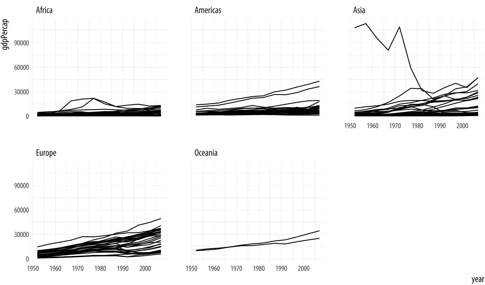 Figure 4.3: Faceting by continent.
p <- ggplot(data = gapminder,
            mapping = aes(x = year,
                          y = gdpPercap))
p + geom_line(aes(group = country)) + facet_wrap(~ continent)
Each facet is labeled at the top. The overall layout minimizes the
duplication of axis labels and other scales. Remember, too that we can
still include other geoms as before, and they will be layered within
each facet. We can also use the ncol argument to facet_wrap() to
control the number of columns used to lay out the facets. Because we
have only five continents it might be worth seeing if we can fit them
on a single row (which means we’ll have five columns). In addition, we
can add a smoother, and a few cosmetic enhancements that make the
graph a little more effective. In particular we will make the country
trends a light gray color. We need to write a little more code to make
all this happen. If you are unsure of what each piece of code does,
take advantage of ggplot’s additive character. Working backwards from
the bottom up, remove each + some_function(...) statement one at a
time to see how the plot changes.
p <- ggplot(data = gapminder, mapping = aes(x = year, y = gdpPercap))
p + geom_line(color="gray70", aes(group = country)) +
    geom_smooth(size = 1.1, method = "loess", se = FALSE) +
    scale_y_log10(labels=scales::dollar) +
    facet_wrap(~ continent, ncol = 5) +
    labs(x = "Year",
         y = "GDP per capita",
         title = "GDP per capita on Five Continents")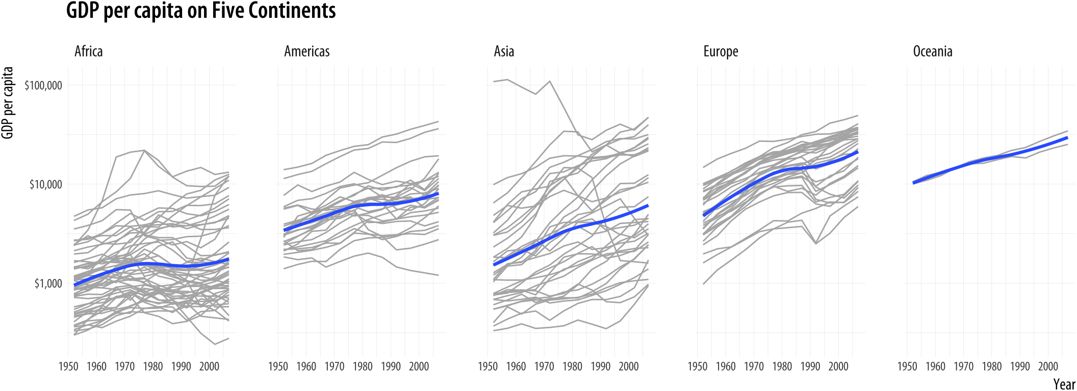
Figure 4.4: Faceting by continent, again.
This plotWe could also have faceted by country, which would have made the group mapping superfluous. But that would make almost a hundred and fifty panels. brings together an aesthetic mapping of x and y variables, a grouping aesthetic (country), two geoms (a lineplot and a smoother), a log-transformed y-axis with appropriate tick labels, a faceting variable (continent), and finally axis labels and a title.
The facet_wrap() function is best used when you want a series of
small multiples based on a single categorical variable. Your panels
will be laid out in order and then wrapped into a grid. If you wish
you can specify the number or rows or the number of columns in the
resulting layout. Facets can be more complex than this. For instance,
you might want to cross-classify some data by two categorical
variables. In that case you should try facet_grid() instead. This
function will lay out your plot in a true two-dimensional arrangement,
instead of a series of panels wrapped into a grid.
To see the difference, let’s introduce gss_sm, a new dataset that we will use in the next few sections, as well as later on in the book. It is a small subset of the questions from the 2016 General Social Survey, or GSS. The GSS is a long-running survey of American adults that asks about a range of topics of interest to social scientists.To begin with, we will use the GSS data in a slightly naive way. In particular we will not consider sample weights when making the figures in this chapter. In Chapter 6 we will learn how to calculate frequencies and other statistics from data with a complex or weighted survey design. The gapminder data consists mostly of continuous variables measured within countries by year. Measures like GDP per capita can take any value across a large range and they vary smoothly. The only categorical grouping variable is continent. It is an unordered categorical variable. Each country belongs to one continent, but the continents themselves have no natural ordering.
In social scientific work, especially when analyzing individual-level survey data, we very often work with categorical data of various kinds. Sometimes the categories are unordered, as with ethnicity or sex. But they may also be ordered, as when me measure highest level of education attained on a scale ranging from elementary school to postgraduate degree. Opinion questions may be asked in yes-or-no terms, or on a five or seven point scale with a neutral value in the middle. Meanwhile, many numeric measures, such as number of children, may still only take integer values within a relatively narrow range. In practice these too may be treated as ordered categorical variables running from zero to some top-coded value such as “Six or more”. Even properly continuous measures, such as income, are rarely reported to the dollar and are often only obtainable as ordered categories. The GSS data in gss_sm contains many measures of this sort. You can take a peek at it, as usual, by typing its name at the console. You could also try glimpse(gss_sm), which will give a very compact summary of all the variables in the data.
We will make a smoothed scatterplot of the relationship between the
age of the respondent and the number of children they have. In
gss_sm the childs variable is a numeric count of the respondent’s
children. (There is also a variable named kids that is the same
measure, but its class is an ordered factor rather than a number.) We
will then facet this relationship by sex and race of the respondent. We
use R’s formula notation in the facet_grid function to facet sex and
race. This time, because we are cross-classifying our results, the formula is two-sided: facet_grid(sex ~ race).
p <- ggplot(data = gss_sm,
            mapping = aes(x = age, y = childs))
p + geom_point(alpha = 0.2) +
    geom_smooth() +
    facet_grid(sex ~ race)
Figure 4.5: Faceting on two categorical variables. Each panel plots the relationship between age and number of children, with the facets breaking out the data by sex (in the rows) and race (in the columns).
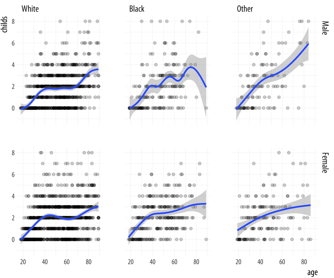
Multi-panel layouts of this kind are especially effective when used to
summarize continuous variation (as in a scatterplot) across two or
more categorical variables, with the categories (and hence the panels)
ordered in some sensible way. We are not limited to two-way
comparison. Further categorical variables can be added to the formula,
too, (e.g. sex ~ race + degree) for more complex multi-way plots.
However, the multiple dimensions of plots like this will become very
complicated very quickly if the variables have more than a few
categories each.
4.4 Geoms can transform data
We have already seen several examples where geom_smooth() was
included as a way to add a trend line to the figure. Sometimes we
plotted a LOESS line, sometimes a straight line from an OLS
regression, and sometimes the result of a Generalized Additive Model. We did not have to have any strong idea of the differences between these methods. Neither did
we have to write any code to specify the underlying models, beyond
telling the method argument in geom_smooth() which one we wanted
to use. The geom_smooth() function did the rest.
Thus, some geoms plot our data directly on the figure, as is
the case with geom_point(), which takes variables designated as x
and y and plots the points on a grid. But other geoms clearly do
more work on the data before it gets plotted.Try p +
stat_smooth(), for example. Every geom_ function has an
associated stat_ function that it uses by default. The reverse is
also the case: every stat_ function has an associated geom_
function that it will plot by default if you ask it to. This is not
particularly important to know by itself, but as we will see in the
next section, we sometimes want to calculate a different statistic
for the geom from the default.
Sometimes the calculations being done by the stat_ functions that
work together with the geom_ functions might not be immediately
obvious. For example, consider this figure produced by a new geom,
geom_bar().
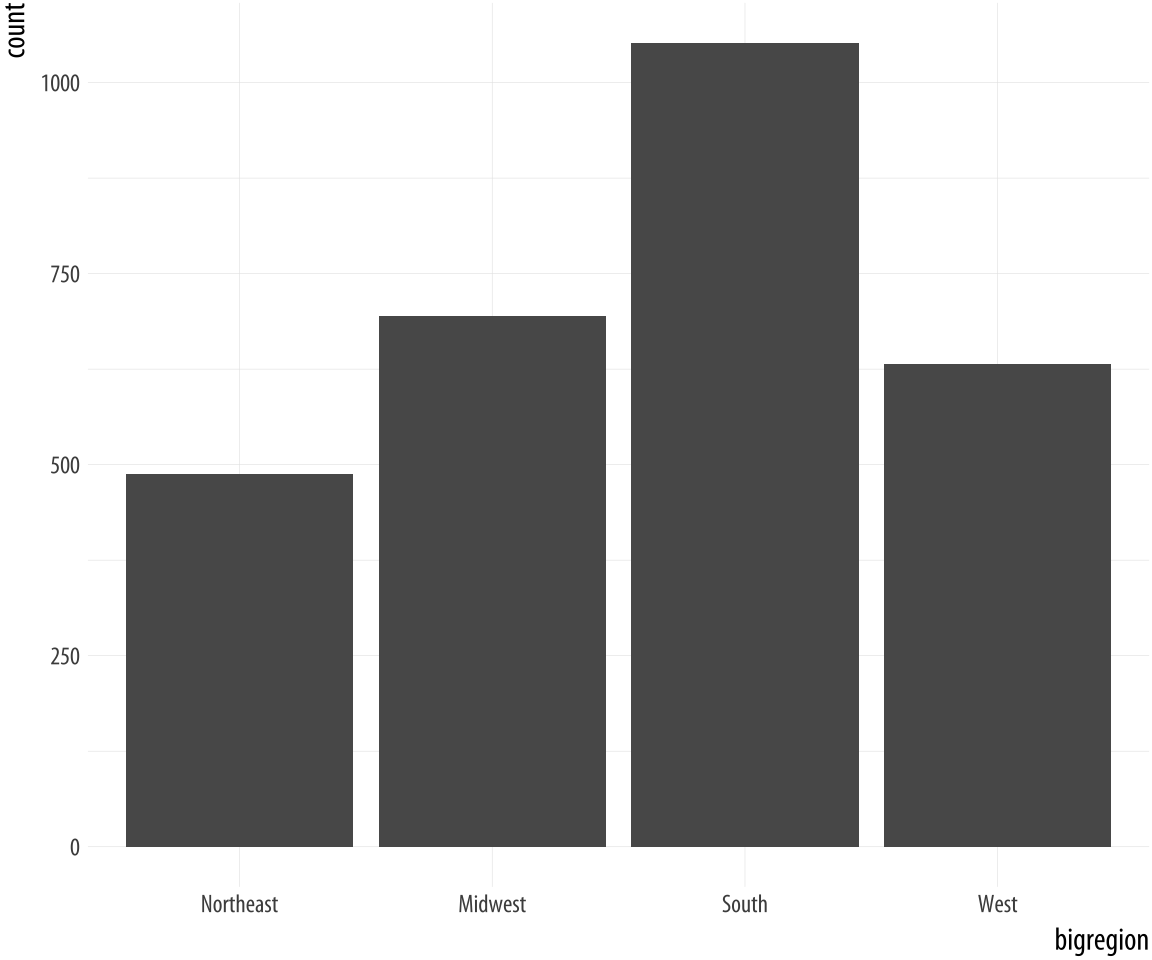 Figure 4.6: A bar chart.
p <- ggplot(data = gss_sm,
            mapping = aes(x = bigregion))
p + geom_bar()
Here we specified just one mapping, aes(x = bigregion). The bar chart produced gives us a count of the number of (individual) observations in the data set by region of the United States. This seems sensible. But there is a y-axis variable here, count, that is not in the data. It has been calculated for us. Behind the scenes, geom_bar called the default stat_ function associated with it, stat_count(). This function computes two new variables, count, and prop (short for proportion). The count statistic is the one geom_bar() uses by default.
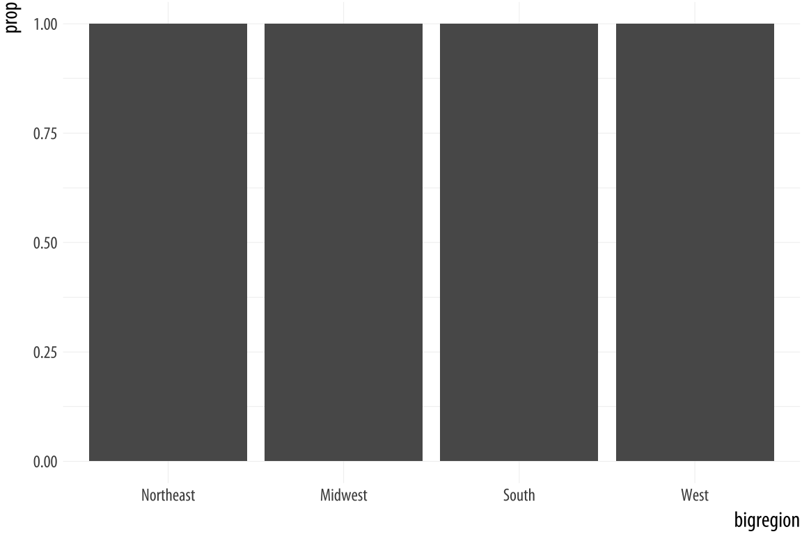 Figure 4.7: A first go at a bar chart with proportions.
p <- ggplot(data = gss_sm,
            mapping = aes(x = bigregion))
p + geom_bar(mapping = aes(y = ..prop..))
If we want a chart of relative frequencies rather than counts, we will
need to get the prop statistic instead. When ggplot calculates the
count or the proportion, it returns temporary variables that we can
use as mappings in our plots. The relevant statistic is called
..prop.. rather than prop. To make sure these temporary variables
won’t be confused with others we are working with, their names begin
and end with two periods. (This is because we might already have a variable called
count or prop in our dataset.) So our calls to it from the aes()
function will generically look like this: <mapping> = <..statistic..>. In this case, we want y to use the calculated
proportion, so we say aes(y = ..prop..).
The resulting plot is still not right. We no longer have a count on
the y-axis, but the proportions of the bars all have a value of 1, so
all the bars are the same height. We want them to sum to 1, so that
we get the number of observations per continent as a proportion of the
total number of observations. This is a grouping issue again. In a
sense, it’s the reverse of the earlier grouping problem we faced when
we needed to tell ggplot that our yearly data was grouped by country.
In this case, we need to tell ggplot to ignore the x-categories when
calculating denominator of the proportion, and use the total number
observations instead. To do so we specify group = 1 inside the
aes() call. The value of 1 is just a kind of “dummy group” that
tells ggplot to use the whole dataset when establishing the
denominator for its prop calculations.
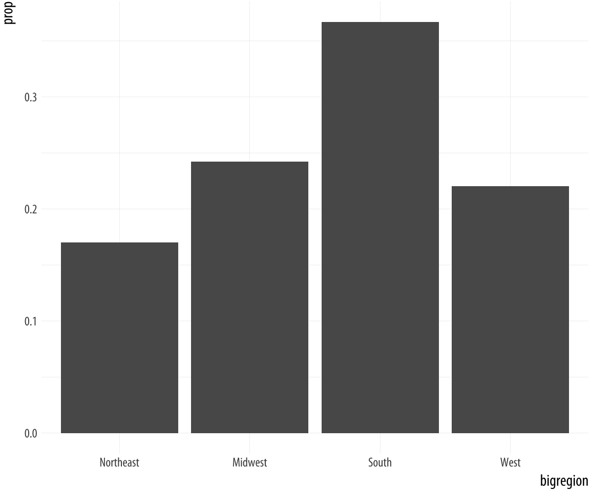 Figure 4.8: A bar chart with correct proportions.
p <- ggplot(data = gss_sm,
mapping = aes(x = bigregion))
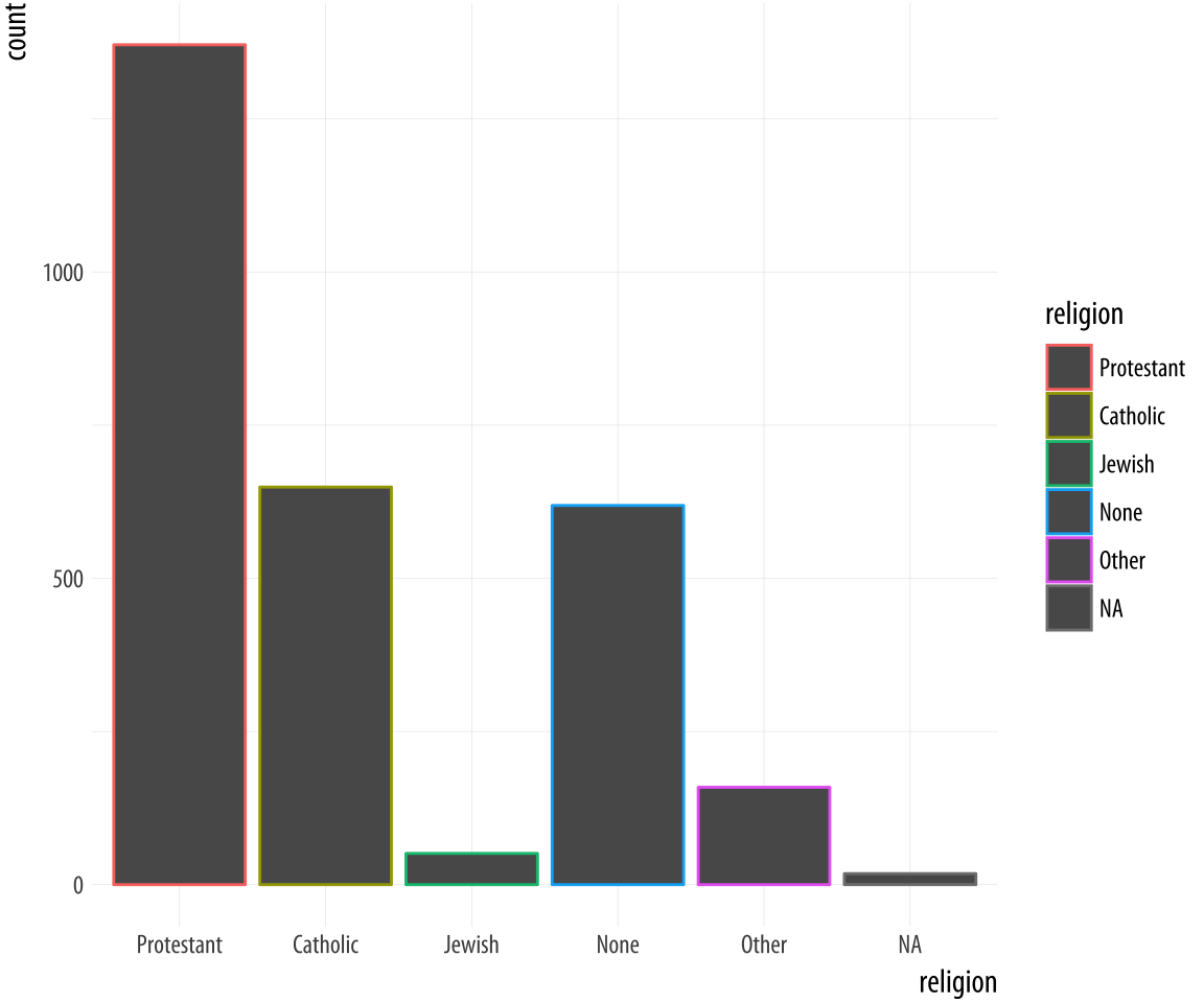
p + geom_bar(mapping = aes(y = ..prop.., group = 1)) Let’s look at another question from the survey. The gss_sm data contains a religion variable derived from a question asking “What is your religious preference? Is it Protestant, Catholic, Jewish, some other religion, or no religion?”
table(gss_sm$religion)##
## Protestant Catholic Jewish None Other
## 1371 649 51 619 159ToRecall that the $ character is one way of accessing individual columns within a data frame or tibble. graph this, we want a bar chart with religion on the x axis (as a
categorical variable), and with the bars in the chart also colored by
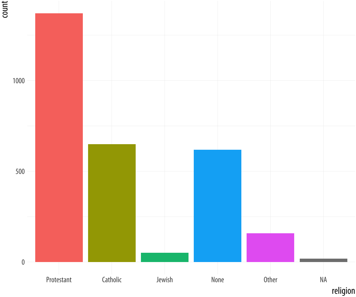
religion. If the gray bars look boring and we want to fill them with color instead, we can map the religion variable to fill in addition to mapping it to x. Remember, fill is for painting the insides of shapes. If we map religion to color, only the border lines of the bars will be assigned colors, and the insides will remain gray.
p <- ggplot(data = gss_sm,
            mapping = aes(x = religion, color = religion))
p + geom_bar()

p <- ggplot(data = gss_sm,
            mapping = aes(x = religion, fill = religion))
p + geom_bar() + guides(fill = FALSE)
Figure 4.9: GSS Religious Preference mapped to color (left) and both color and fill (right).
By doing this, we have mapped two aesthetics to the same variable.
Both x and fill are mapped to religion. There is nothing wrong
with this. However, these are still two separate
mappings, and so they get two separate scales. The default is to show a legend for the color variable. This legend is redundant, because the categories of
religion are already separated out on the x-axis. In its simplest
use, the guides() function controls whether guiding information
about any particular mapping appears or not. If we set guides(fill = FALSE), the legend is removed, in effect saying that the viewer of
the figure does not need to be shown any guiding information about
this mapping. Setting the guide for some mapping to FALSE only has
an effect if there is a legend to turn off to begin with. Trying x = FALSE or y = FALSE will have no effect, as these mappings have no
additional guides or legends separate from their scales. It is
possible to turn the x and y scales off altogether, but this is done
though a different function, one from the scale_ family.
4.5 Frequency plots the slightly awkward way
A more appropriate use of the fill aesthetic with geom_bar() is to
cross-classify two categorical variables. This is the graphical
equivalent of a frequency table of counts or proportions. Using the
GSS data, for instance, we might want to examine the distribution of
religious preferences within different regions of the United States.
In the next few paragraphs we will see how to do this just using
ggplot. However, as we shall also discover, it is often not the most
transparent way to make frequency tables of this sort. The next
chapter introduces a simpler and less error-prone approach where we
calculate the table first before passing the results along to ggplot
to graph. As you work through this section, bear in mind that if you
find things slightly awkward or confusing it is because that’s exactly
what they are.
Let’s say we want to look at religious preference by census region.
That is, we want the religion variable broken down proportionally
within bigregion. When we cross-classify categories in bar charts,
there are several ways to display the results. With geom_bar() the
output is controlled by the position argument. Let’s begin by
mapping fill to religion.
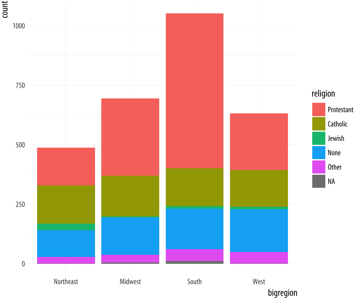 Figure 4.10: A stacked bar chart of Religious Preference by Census Region.
p <- ggplot(data = gss_sm,
            mapping = aes(x = bigregion, fill = religion))
p + geom_bar()
The default output of geom_bar() is a stacked bar chart, with counts
on the y-axis (and hence counts within the stacked segments of the
bars also). Region of the country is on the x-axis, and counts of
religious preference are stacked within the bars. As we saw in Chapter 1,
it is somewhat difficult for readers of the chart to compare lengths
an areas on an unaligned scale. So while the relative position of the
bottom categories are quite clear (thanks to them all being aligned on
the x-axis), the relative positions of say, the “Catholic” category is
harder to assess. An alternative choice is to set the position
argument to "fill". (This is different from the fill
aesthetic.)
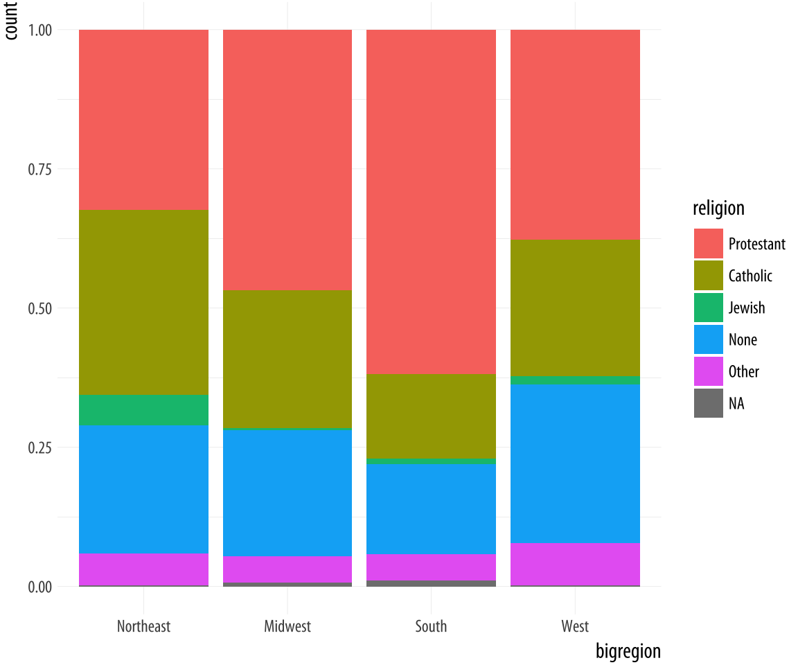 Figure 4.11: Using the fill position adjustment to show relative proportions across categories.
p <- ggplot(data = gss_sm,
            mapping = aes(x = bigregion, fill = religion))
p + geom_bar(position = "fill")
Now the bars are all the same height, which makes it easier to compare
proportions across groups. But we lose the ability to see the relative
size of each cut with respect to the overall total. What if we wanted
to show the proportion or percentage of religions within regions of
the country, like in Figure 4.11, but instead of
stacking the bars we wanted separate bars instead? As a first attempt, we
can use position="dodge" to make the bars within each region of the
country appear side by side. However, if we do it this way (try it),
we will find that ggplot places the bars side-by-side as intended, but
changes the y-axis back to a count of cases within each category
rather than showing us a proportion. We saw in Figure
4.8 that to display a proportion we needed to map
y = ..prop.., so the correct statistic would be calculated. Let’s
see if that works.
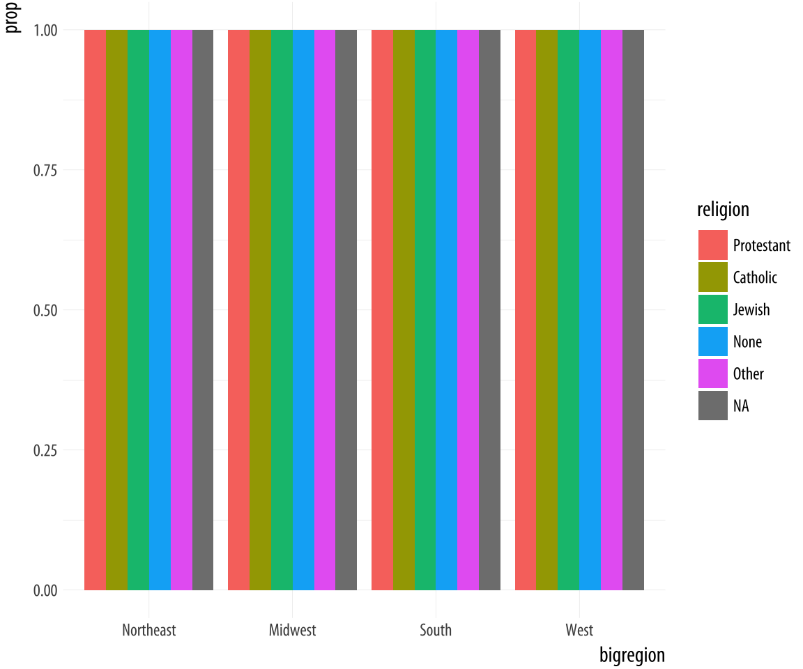 Figure 4.12: A first go at a dodged bar chart with proportional bars.
p <- ggplot(data = gss_sm,
            mapping = aes(x = bigregion, fill = religion))
p + geom_bar(position = "dodge",
             mapping = aes(y = ..prop..))
The result is certainly colorful, but not what we wanted.
Just as in Figure 4.7, there seems to be an
issue with the grouping. When we just wanted the overall proportions
for one variable, we mapped group = 1 to tell ggplot to calculate
the proportions with respect to the overall N. In this case our
grouping variable is religion, so we might try mapping that to the
group aesthetic.
p <- ggplot(data = gss_sm,
            mapping = aes(x = bigregion, fill = religion))
p + geom_bar(position = "dodge",
             mapping = aes(y = ..prop.., group = religion))
This gives us a bar chart where the values of religion are broken
down across regions, with a proportion showing on the y-axis. If you
inspect the bars in Figure 4.13, you will
see that they do not sum to one within each region. Instead, the bars
for any particular religion sum to one across regions.
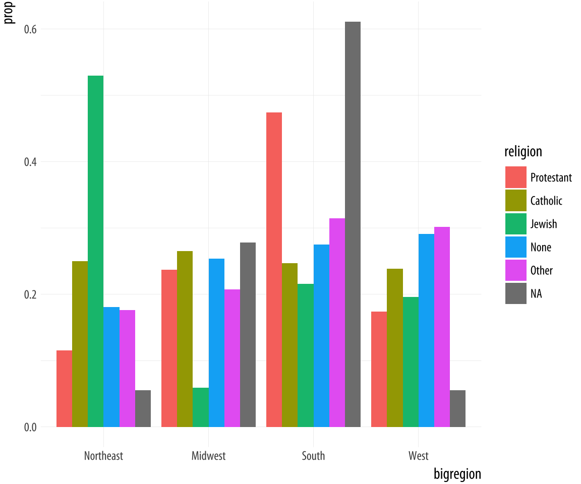 Figure 4.13: A second attempt at a dodged bar chart with proportional bars.
This lets us see that nearly half of those who said they were Protestant live in the South, for example. Meanwhile, just over ten percent of those saying they were Protestant live in the Northeast. Similarly, it shows that over half of those saying they were Jewish live in the Northeast, compared to about a quarter who live in the South.Proportions for smaller sub-populations tend to bounce around from year to year in the GSS.
We are still not quite where we originally wanted to be. Our goal was to take the stacked bar chart in Figure 4.10 but have the proportions shown side-by-side instead of on top of one another.
p <- ggplot(data = gss_sm,
            mapping = aes(x = religion))
p + geom_bar(position = "dodge",
             mapping = aes(y = ..prop.., group = bigregion)) +
    facet_wrap(~ bigregion, ncol = 1)
It turns out that the easiest thing to do is to stop trying to force geom_bar() to do all the work in a single step. Instead, we can ask ggplot to give us a proportional bar chart of religious affiliation, and then facet that by region. The proportions are calculated within each panel, which is the breakdown we wanted. This has the added advantage of not producing too many bars within each category.
Figure 4.14: Faceting proportions within region.
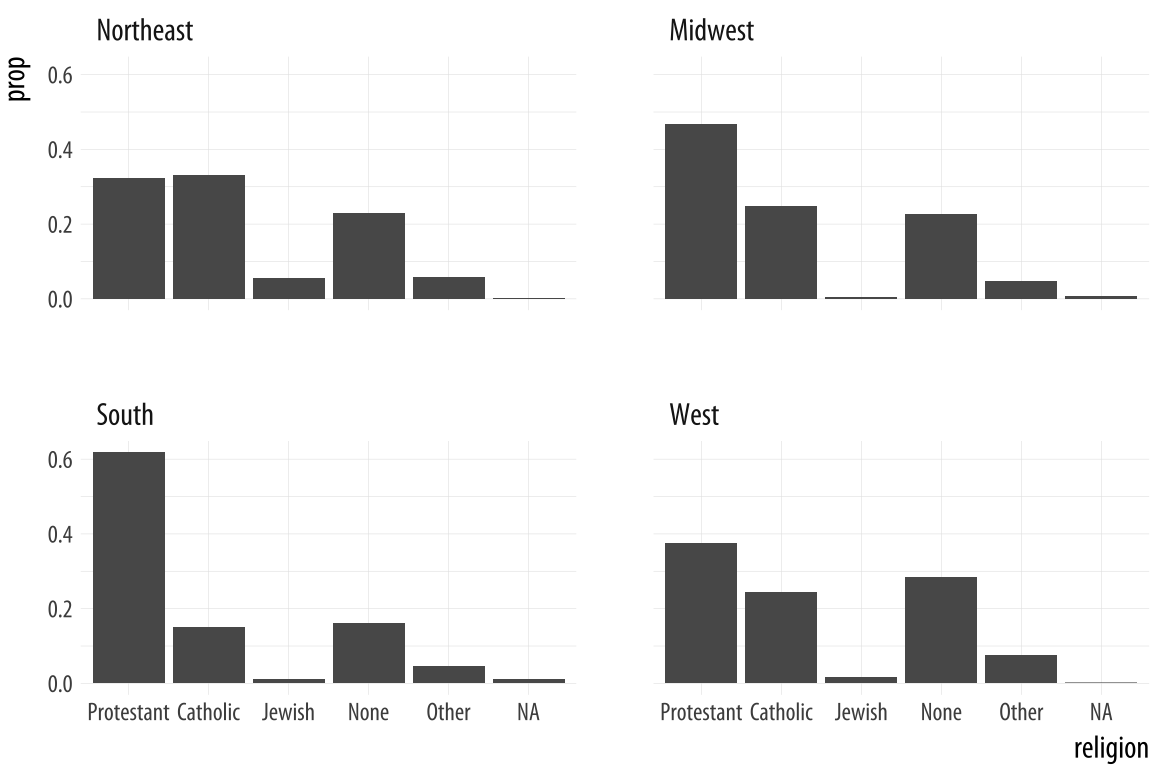
We could polish this plot further, but for the moment we will stop here. When constructing frequency plots directly in ggplot, it is a little too easy to get stuck in a cycle of not quite getting the marginal comparison that you want, and more or less randomly poking at the mappings to try to stumble on the the right breakdown. In the next Chapter, we will learn how to use the tidyverse’s dplyr library to produce the tables we want before we try to plot them. This is a more reliable approach, and easier to check for errors. It will also give us tools that can be used for many more tasks than producing summaries.
4.6 Histograms and density plots
Different geoms transform data in different ways, but ggplot’s vocabulary for them is consistent. We can see similar transformations at work when summarizing a continuous variable using a histogram, for example. A histogram is a way of summarizing a continuous variable by chopping it up into segments or “bins” and counting how many observations are found within each bin. In a bar chart, the categories are given to us going in (e.g., regions of the country, or religious affiliation). With a histogram, we have to decide how finely to bin the data.
For example, ggplot comes with a dataset, midwest, containing information on counties in several midwestern states of the USA. Counties vary in size, so we can make a histogram showing the distribution of their geographical areas. Area is measured in square miles. Because we are summarizing a continuous variable using a series of bars, we need to divide the observations into groups, or bins, and count how many are in each one. By default, the geom_histogram() function will choose a bin size for us based on a rule of thumb.
p <- ggplot(data = midwest,
            mapping = aes(x = area))
p + geom_histogram()
## `stat_bin()` using `bins = 30`. Pick better value with
## `binwidth`.p <- ggplot(data = midwest,
mapping = aes(x = area))
p + geom_histogram(bins = 10)Figure 4.15: Histograms of the same variable, using different numbers of bins.
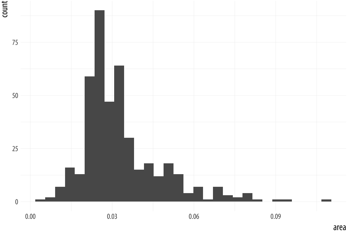
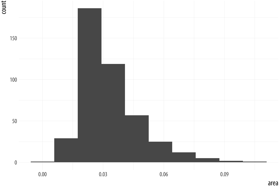
As with the bar charts, a newly-calculated variable, count, appears on the x-axis. The notification from R tells us that behind the scenes the stat_bin() function picked 30 bins, but we might want to try something else. When drawing histograms it is worth experimenting with bins and also optionally the origin of the x-axis. Each, and
especially bins, will make a big difference to how the resulting
figure looks.
While histograms summarize single variables, it’s also possible to use
several at once to compare distributions. We can facet histograms by
some variable of interest, or as here we can compare them in the
same plot using the fill mapping.
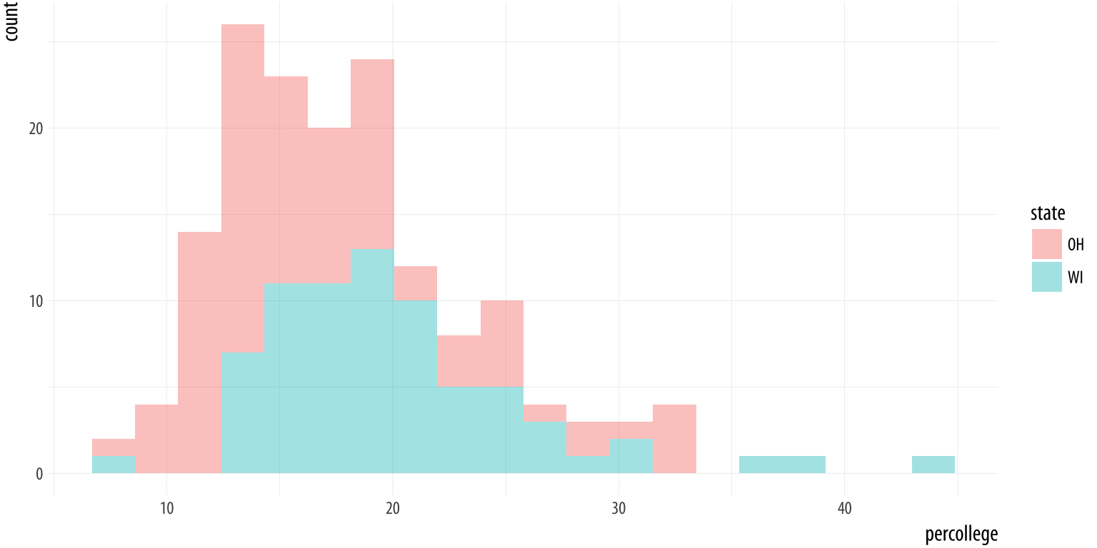 Figure 4.16: Comparing two histograms.
oh_wi <- c("OH", "WI")

p <- ggplot(data = subset(midwest, subset = state %in% oh_wi),
            mapping = aes(x = percollege, fill = state))
p + geom_histogram(alpha = 0.4, bins = 20)
We subset the data here to pick out just two states. To do this we
create a character vector with just two elements, “OH” and “WI”. Then
we use the subset() function to take our data and filter it so that
we only select rows whose state name is in this vector. The %in%
operator is a convenient way to filter on more than one term in a
variable when using subset().
When working with a continuous variable, an alternative to binning the
data and making a histogram is to calculate a kernel density estimate
of the underlying distribution. The geom_density() function will do
this for us.
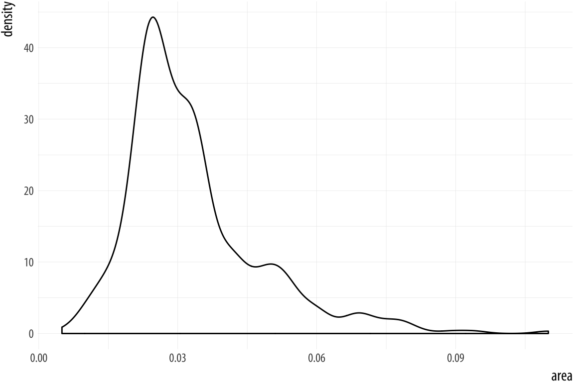 Figure 4.17: Kernel density estimate of county areas.
p <- ggplot(data = midwest,
            mapping = aes(x = area))
p + geom_density()
We can use color (for the lines) and fill (for the body of the
density curve) here, too. These figures often look quite nice.
But when there are several filled areas on the plot, as in this
case, the overlap can become hard to read. If you want to make the
baselines of the density curves go away, you can use geom_line(stat = "density") instead. This also removes the possibility of using the
fill aesthetic. But this may be an improvement in some cases. Try it
with the plot of state areas and see how they compare.
p <- ggplot(data = midwest,
            mapping = aes(x = area, fill = state, color = state))
p + geom_density(alpha = 0.3)
Figure 4.18: Comparing distributions.
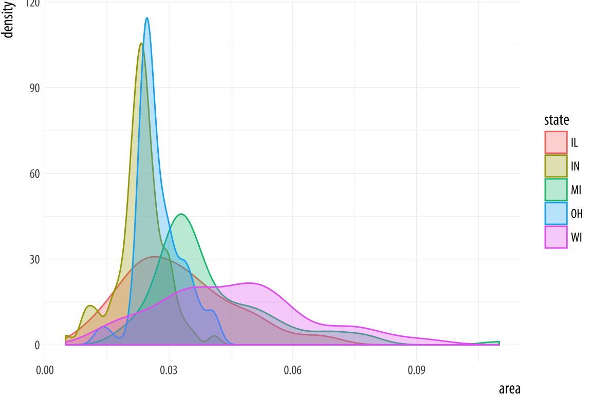
Just like geom_bar(), the count-based defaults computed by the
stat_ functions used by geom_histogram() and geom_density() will
return proportional measures if we ask them. For geom_density(), the
stat_density() function can return its default ..density..
statistic, or ..scaled.., which will give a proportional density
estimate. It can also return a statistic called ..count.., which is
the density times the number of points. This can be used in stacked
density plots.
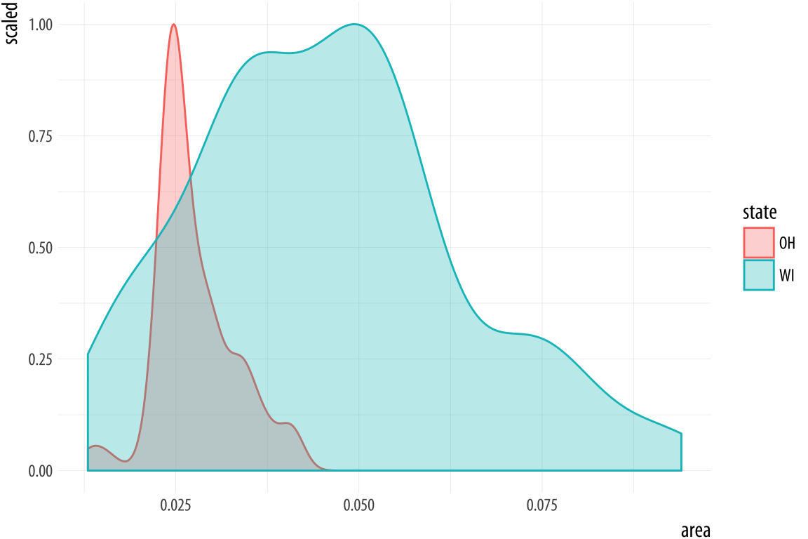 Figure 4.19: Scaled densities.
p <- ggplot(data = subset(midwest, subset = state %in% oh_wi),
            mapping = aes(x = area, fill = state, color = state))
p + geom_density(alpha = 0.3, mapping = (aes(y = ..scaled..)))
4.7 Avoid transformations when necessary
As we have seen from the beginning, ggplot normally makes its charts
starting from a full dataset. When we call geom_bar() it does its
calculations on the fly using stat_count() behind the scenes to
produce the counts or proportions it displays. In the previous
section, we looked at a case where we wanted to group and aggregate
our data ourselves before handing it off to ggplot. But often, our
data is in effect already a summary table. This can happen when we
have computed a table of marginal frequencies or percentages from our
original data already. Plotting results from statistical models also
puts us in this position, as we will see later. Or it may be that we
just have a finished table of data (from the Census, say, or an
official report) that we want to make into a graph. For example,
perhaps we do not have the individual-level data on who survived the
Titanic disaster, but we do have a small table of counts of
survivors by sex:
titanic## fate sex n percent
## 1 perished male 1364 62.0
## 2 perished female 126 5.7
## 3 survived male 367 16.7
## 4 survived female 344 15.6Because we are working directly with percentage values in a summary
table, we no longer have any need for ggplot to count up values for us
or perform any other calculations. That is, we do not need the
services of any stat_ functions that geom_bar() would normally
call. We can tell geom_bar() not to do any work on the variable
before plotting it. To do this we say stat = 'identity' in the
geom_bar() call. We’ll also move the legend to the top of the chart.
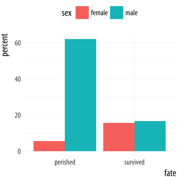 Figure 4.20: Survival on the Titanic, by Sex.
p <- ggplot(data = titanic,
            mapping = aes(x = fate, y = percent, fill = sex))
p + geom_bar(position = "dodge", stat = "identity") + theme(legend.position = "top")
For convenience ggplot also provides a related geom, geom_col(),
which has exactly the same effect but assumes that stat = "identity". We will use this form in future when we don’t need any calculations done on the plot.
The position argument in geom_bar() and geom_col() can also take the value of "identity". Just as stat = "identity" means “don’t do any summary calculations”, position = "identity" means “just plot the values as given”. This allows us to do things like, for example, plot a flow of positive and negative values in a bar chart. This sort of graph is an alternative to a line plot and is often seen in public policy settings where changes relative to some threshold level or baseline are of interest. For example, the oecd_sum table in socviz contains information on average life expectancy at birth within the United States, and across other OECD countries.
oecd_sum## # A tibble: 57 x 5
## # Groups: year [57]
## year other usa diff hi_lo
## <int> <dbl> <dbl> <dbl> <chr>
## 1 1960 68.6 69.9 1.30 Below
## 2 1961 69.2 70.4 1.20 Below
## 3 1962 68.9 70.2 1.30 Below
## 4 1963 69.1 70.0 0.900 Below
## 5 1964 69.5 70.3 0.800 Below
## 6 1965 69.6 70.3 0.700 Below
## 7 1966 69.9 70.3 0.400 Below
## 8 1967 70.1 70.7 0.600 Below
## 9 1968 70.1 70.4 0.300 Below
## 10 1969 70.1 70.6 0.500 Below
## # ... with 47 more rowsThe other column is the average life expectancy in a given year for OECD countries, excluding the United States. The usa column is the US life expectancy, diff is the difference between the two values, and hi_lo indicates whether the US value for that year was above or below the OECD average. We will plot the difference over time, and use the hi_lo variable to color the columns in the chart.
p <- ggplot(data = oecd_sum,
            mapping = aes(x = year, y = diff, fill = hi_lo))
p + geom_col() + guides(fill = FALSE) +
  labs(x = NULL, y = "Difference in Years",
       title = "The US Life Expectancy Gap",
       subtitle = "Difference between US and OECD
                   average life expectancies, 1960-2015",
       caption = "Data: OECD. After a chart by Christopher Ingraham,
                  Washington Post, December 27th 2017.")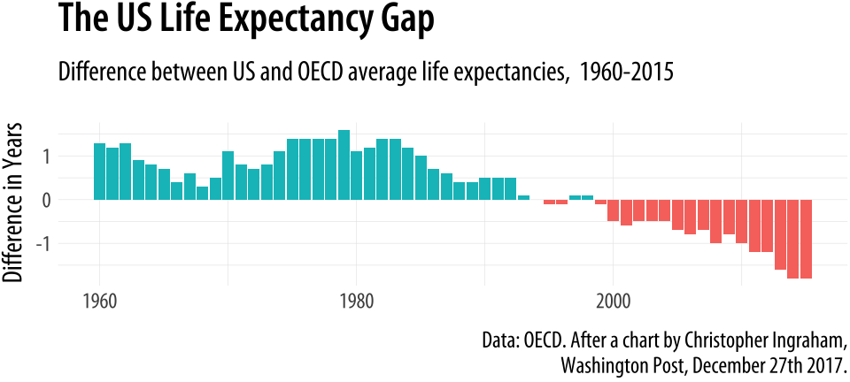
Figure 4.21: Using geom_col() to plot negative and positive values in a bar chart.
As with the titanic plot, the default action of geom_col() is to set both stat and position to “identity”. To get the same effect with geom_bar() we would need to say geom_bar(position = "identity"). As before, the guides(fill=FALSE) instruction at the end tells ggplot to drop the unnecessary legend that would otherwise be automatically generated to accompany the fill mapping.
At this point, we have a pretty good sense of the core steps we must take to visualize our data. In fact, thanks to ggplot’s default settings, we now have the ability to make good-looking and informative plots. Starting with a tidy dataset, we know how to map variables to aesthetics, to choose from a variety of geoms, and make some adjustments to the scales of the plot. We also know more about selecting the right sort of computed statistic to show on the graph, if that’s what’s needed, and how to facet our core plot by one or more variables. We know how to set descriptive labels for axes, and write a title, subtitle, and caption. Now we’re in a position to put these skills to work in a more fluent way.
4.8 Where to go next
- Revisit the
gapminderplots at the beginning of the chapter and experiment with different ways to facet the data. Try plotting population and per capita GDP while faceting on year, or even on country. In the latter case you will get a lot of panels, and plotting them straight to the screen may take a long time. Instead, assign the plot to an object and save it as a PDF file to yourfigures/folder. Experiment with the height and width of the figure. - Investigate the difference between a formula written as
facet_grid(sex ~ race)versus one written asfacet_grid(~ sex + race). - Experiment to see what happens when you use
facet_wrap()with more complex forumulas likefacet_wrap(~ sex + race)instead offacet_grid. Likefacet_grid(), thefacet_wrap()function can facet on two or more variables at once. But it will do it by laying the results out in a wrapped one-dimensional table instead of a fully cross-classified grid. - Frequency polygons are closely related to histograms. Instead of displaying the count of observations using bars, they display it with a series of connected lines instead. You can try the various
geom_histogram()calls in this chapter usinggeom_freqpoly()instead. - A histogram bins observations for one variable and shows a bars with the count in each bin. We can do this for two variables at once, too. The
geom_bin2d()function takes two mappings,xandy. It divides your plot into a grid and colors the bins by the count of observations in them. Try using it on thegapminderdata to plot life expectancy versus per capita GDP. Like a histogram, you can vary the number or width of the bins for bothxory. Instead of sayingbins = 30orbinwidth = 1, provide a number for bothxandywith, for example,bins = c(20, 50). If you specifybindwithinstead, you will need to pick values that are on the same scale as the variable you are mapping. - Density estimates can also be drawn in two dimensions. The
geom_density_2d()function draws contour lines estimating the joint distribution of two variables. Try it with themidwestdata, for example, plotting percent below the poverty line (percbelowpoverty) against percent college-educated (percollege). Try it with and without ageom_point()layer.