5 Graph tables, add labels, make notes
This Chapter builds on the foundation we have laid down. Things will
get a little more sophisticated in three ways. First, we will learn
about how to transform data before we send it to ggplot to be turned
into a figure. As we saw in Chapter 4, ggplot’s
geoms will often summarize data for us. While convenient, this can
sometimes be awkward or even a little opaque. Often, it’s better to
get things into the right shape before we send anything to ggplot.
This is a job for another tidyverse component, the dplyr library. We
will learn how to use some of its “action verbs” to select, group,
summarize and transform our data.
Second, we will expand the number of geoms we know about, and learn more about how to choose between them. The more we learn about ggplot’s geoms, the easier it will be to pick the right one given the data we have and the visualization we want. As we learn about new geoms, we will also get a little more adventurous and depart from some of ggplot’s default arguments and settings. We will learn how to reorder the variables displayed in our figures, and how to subset the data we use before we display it.
Third, this process of gradual customization will give us the opportunity to learn a little more about the scale, guide, and theme functions that we have mostly taken for granted until now. These will give us even more control over the content and appearance of our graphs. Together, these techniques can be used to make plots much more legible to readers. They allow us to present our data in a more structured and easily comprehensible way, and to pick out the elements of it that are of particular interest. We will begin to use these techniques to layer geoms on top of one another, a technique that will allow us to produce very sophisticated graphs in a systematic, comprehensible way.
Our basic approach will not change. No matter how complex our plots get, or how many individual steps we take to layer and tweak their features, underneath we will always be doing the same thing. We want a table of tidy data, a mapping of variables to aesthetic elements, and a particular type of graph. If you can keep sight of this, it will make it easier to confidently approach the job of getting any particular graph to look just right.
Table 5.1: Column marginals. (Numbers in columns sum to 100.)
| Protestant | Catholic | Jewish | None | Other | NA | |
|---|---|---|---|---|---|---|
| Northeast | 12 | 25 | 53 | 18 | 18 | 6 |
| Midwest | 24 | 27 | 6 | 25 | 21 | 28 |
| South | 47 | 25 | 22 | 27 | 31 | 61 |
| West | 17 | 24 | 20 | 29 | 30 | 6 |
5.1 Use pipes to summarize data
In Chapter 4 we began making plots of the distributions and relative frequencies of variables. Cross-classifying one measure by another is one of the basic descriptive tasks in data analysis. Tables 5.1 and 5.2 show two common ways of summarizing our GSS data on the distribution of religious affiliation and region. Table 5.1 shows the column marginals, where the numbers sum to a hundred by column and show, e.g., the distribution of Protestants across regions. Meanwhile in Table 5.2 the numbers sum to a hundred across the rows, showing for example the distribution of religious affiliations within any particular region.
We saw in Chapter 4 that geom_bar() can plot
both counts and relative frequencies depending on what we asked of it.
In practice, though, letting the geoms (and their stat_ functions)
do the work can sometimes get a little confusing. It is too easy to
lose track of whether one has calculated row margins, column margins,
or overall relative frequencies. The code to do the calculations on
the fly ends up stuffed into the mapping function and can become hard
to read. A better strategy is to calculate the frequency table you
want first, and then plot that table. This has the benefit of allowing
you do to some quick sanity checks on your tables, to make sure you
haven’t made any errors.
Table 5.2: Row marginals. (Numbers in rows sum to 100.)
| Protestant | Catholic | Jewish | None | Other | NA | |
|---|---|---|---|---|---|---|
| Northeast | 32 | 33 | 6 | 23 | 6 | 0 |
| Midwest | 47 | 25 | 0 | 23 | 5 | 1 |
| South | 62 | 15 | 1 | 16 | 5 | 1 |
| West | 38 | 25 | 2 | 28 | 8 | 0 |
Let’s say we want a plot of the row-marginals for religion within
region. We will take the opportunity to do a little bit of
data-munging in order to get from our underlying table of GSS data to
the summary tabulation that we want to plot. To do this we will use
the tools provided by dplyr, a component of the tidyverse library
that provides functions for manipulating and reshaping tables of data
on the fly. We start from our individual-level gss_sm data frame
with its bigregion and religion variables. Our goal is a summary
table with percentages of religious preferences grouped within region.
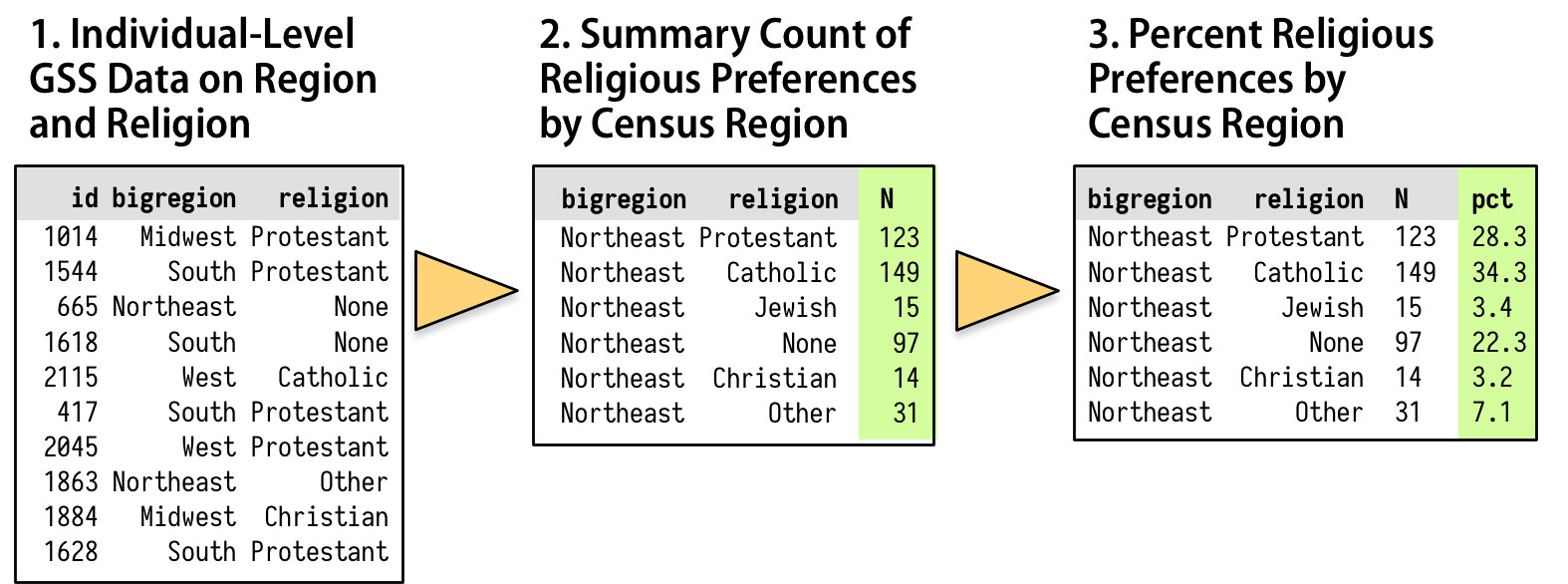
Figure 5.1: How we want to transform the individual-level data.
As shown schematically in Figure 5.1, we will
start with our individual-level table of about 2,500 GSS respondents.
Then we want to summarize them into a new table that shows a count of
each religious preference, grouped by region. Finally we will turn
these within-region counts into percentages, where the denominator is
the total number of respondents within each region. The dplyr
library provides a few tools to make this easy and clear to read. We
will use a special operator, %>%, to do our work. This is the pipe
operator. It plays the role of the yellow triangle in Figure 5.1, in that it helps us perform the actions that get us from one table to the next.
We have being building our plots in an additive fashion, starting
with a ggplot object and layering on new elements. By analogy,
think of the %>% operator as allowing us to start with a data frame
and perform a sequence or pipeline of operations to turn it into
another, usually smaller and more aggregated table. Data goes in one
side of the pipe, actions are performed via functions, and results
come out the other. A pipeline is typically a series of operations
that do one or more of four things:
- Group
group_by()the data into the nested structure we want for our summary, such as “Religion by Region” or “Authors by Publications by Year”. - Filter
filter()rows;select()columns or select pieces of the data by row, column, or both. This gets us the piece of the table we want to work on. - Mutate
mutate()the data by creating new variables at the current level of grouping. This adds new columns to the table without aggregating it. - Summarize
summarize()or aggregate the grouped data. This creates new variables at a higher level of grouping. For example we might calculate means withmean()or counts withn(). This results in a smaller, summary table, which we might do more things on if we want.
We use the dplyr functions group_by(), filter(), select(),
mutate(), and summarize() to carry out these tasks within our
pipeline. They are written in a way that allows them to be easily
piped. That is, they understand how to take inputs from the left side
of a pipe operator and pass results along through the right side of
one. The dplyr documentation has some useful vignettes that introduce
these grouping, filtering, selection, and transformation functions.
There is also a more detailed discussion of these tools, along with
many more examples, in Wickham & Grolemund (2016).
We will create a new table called rel_by_region. Here’s the code:
rel_by_region <- gss_sm %>%
    group_by(bigregion, religion) %>%
    summarize(N = n()) %>%
    mutate(freq = N / sum(N),
           pct = round((freq*100), 0))
What are these lines doing? First, we are creating an object as usual,
with the familiar assignment operator, <-. Next, at the steps to the
right. Read the objects and functions from left to right, with the
pipe operator “%>%” connecting them together meaning “and then …”. Objects on the left hand side “pass through” the pipe, and whatever
is specified on the right of the pipe gets done to that object. The
resulting object then passes through to the right again, and so on
down to the end of the pipeline.
Reading from the left, the code says this:
- Create
rel_by_region <- gss_sm %>%a new object,rel_by_region. It will get the result of the following sequence of actions: Start with thegss_smdata, and then - Group
group_by(bigregion, religion) %>%the rows bybigregionand, within that, byreligion. - Summarize this table
summarize(N = n()) %>%to create a new, much smaller table, with three columns:bigregion,religion, and a new summary variable,N, that is a count of the number of observations within each religious group for each region. - With this new table,
mutate(freq = N / sum(N), pct = round((freq*100), 0))use theNvariable to calculate two new columns: the relative proportion (freq) and percentage (pct) for each religious category, still grouped by region. Round the results to the nearest percentage point.
In this way of doing things, objects passed along the pipeline and the
functions acting on them carry some assumptions about their context.
For one thing, you don’t have to keep specifying the name of the
underlying data frame object you are working from. Everything is
implicitly carried forward from gss_sm. Within the pipeline, the
transient or implicit objects created from your summaries and other
transformations are carried through, too.
Second, the group_by() function sets up how the grouped or nested
data will be processed within the summarize() step. Any function
used to create a new variable within summarize(), such as mean()
or sd() or n(), will be applied to the innermost grouping level
first. Grouping levels are named from left to right within
group_by() from outermost to innermost. So the function call
summarize(N = n()) counts up the number of observations for each
value of religion within bigregion and puts them in a new variable
named N. As dplyr’s functions see things, summarizing actions “peel
off” one grouping level at a time, so that the resulting summaries are
at the next level up. In this case, we start with individual-level
observations and group them by religion within region. The
summarize() operation aggregates the individual observations to
counts of the number of people affiliated with each religion, for
each region.
Third, the mutate() step takes the N variable and uses it to
create freq, the relative frequency for each subgroup within region,
and finally pct, the relative frequency turned into a rounded
percentage. These mutate() operations add or remove columns from
tables, but do not change the grouping level.
Inside both mutate() and summarize(), we are able to create new
variables in a way that we have not seen before. Usually, when we see
something like name = value inside a function, the name is a
general, named argument and the function is expecting information from
us about the specific value it should take.As in the
case of aes(x = gdpPercap, y = lifeExp), for example.
Normally if we give a function a named argument it doesn’t know about
(aes(chuckles = year)) it will ignore it, complain, or break. With
summarize() and mutate(), however, we can invent named arguments.
We are still assigning specific values to N, freq, and pct, but
we pick the names, too. They are the names that the newly-created
variables in the summary table will have. The summarize() and
mutate() functions do not need to know what they will be in advance.
Finally, when we use mutate() to create the freq variable, not
only can we make up that name within the function, mutate() is also
clever enough to let us use that name right away, on the next line
of the same function call, when we create the pct variable. This
means we do not have to repeatedly write separate mutate() calls for
every new variable we want to create.
Our pipeline takes the gss_sm data frame, which has 2867 rows and 32 columns, and transforms it into rel_by_region, a summary table with 24 rows and 5 columns that looks like this, in part:
rel_by_region## # A tibble: 24 x 5
## # Groups: bigregion [4]
## bigregion religion N freq pct
## <fct> <fct> <int> <dbl> <dbl>
## 1 Northeast Protestant 158 0.324 32.0
## 2 Northeast Catholic 162 0.332 33.0
## 3 Northeast Jewish 27 0.0553 6.00
## 4 Northeast None 112 0.230 23.0
## 5 Northeast Other 28 0.0574 6.00
## 6 Northeast <NA> 1 0.00205 0
## 7 Midwest Protestant 325 0.468 47.0
## 8 Midwest Catholic 172 0.247 25.0
## 9 Midwest Jewish 3 0.00432 0
## 10 Midwest None 157 0.226 23.0
## # ... with 14 more rowsThe variables specified in group_by() are retained in the new
summary table; the variables created with summarize() and mutate()
are added, and all the other variables in the original dataset are
dropped.
We said before that, when trying to grasp what each additive step in a
ggplot() sequence does, it can be helpful to work backwards,
removing one piece at a time to see what the plot looks like when that
step is not included. In the same way, when looking at pipelined code
it can be helpful to start from the end of the line, and then remove one
“%>%” step at a time to see what the resulting intermediate object
looks like. For instance, what if we remove the mutate() step from
the code above? What does rel_by_region look like then? What if we
remove the summarize() step? How big is the table returned at each
step? What level of grouping is it at? What variables have been added
or removed?
Plots that do not require sequential aggregation and transformation of
the data before they are displayed are usually easy to write directly
in ggplot, as the details of the layout are handled by a combination
of mapping variables and layering geoms. One-step filtering or
aggregation of the data (such as calculating a proportion, or a
specific subset of observations) is also straightforward. But when the
result we want to display is several steps removed from the data, and
in particular when we want to group or aggregate a table and do some
more calculations on the result before drawing anything, then it can
make sense to use dplyr’s tools to produce these summary tables
first. This is true even if would also be possible to do it within a ggplot()
call. In addition to making our code easier to read, it lets us more
easily perform sanity checks on our results, so that we are sure we
have grouped and summarized things in the right order. For instance,
if we have done things properly with rel_by_region, the pct values
associated with religion should sum to 100 within each region,
perhaps with a bit of rounding error. We can quickly check this using
a very short pipeline, too:
rel_by_region %>% group_by(bigregion) %>%
    summarize(total = sum(pct))
## # A tibble: 4 x 2
## bigregion total
## <fct> <dbl>
## 1 Northeast 100
## 2 Midwest 101
## 3 South 100
## 4 West 101This looks good. As before, now that we are working directly with
percentage values in a summary table, we can use geom_col() instead
of geom_bar().
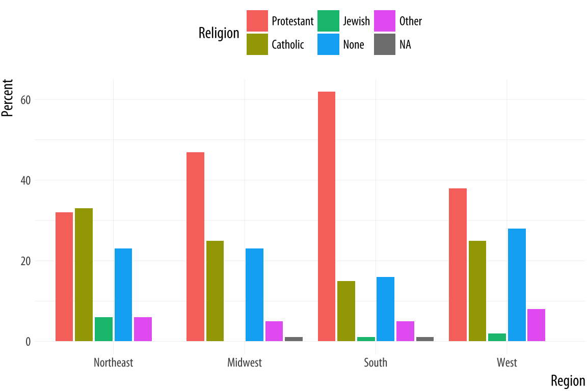 Figure 5.2: Religious preferences by Region.
p <- ggplot(rel_by_region, aes(x = bigregion, y = pct, fill = religion))
p + geom_col(position = "dodge2") +
    labs(x = "Region",y = "Percent", fill = "Religion") +
    theme(legend.position = "top")
We use a different position argument here, dodge2 instead of
dodge. This puts the bars side by side. When dealing with
pre-computed values in geom_col(), the default position is to make
a proportionally stacked column chart. If you use dodge they will be
stacked within columns but the result will read incorrectly. Using
dodge2 puts the sub-categories (religious affiliations) side-by-side
within groups (regions).
The values in this bar chart are the percentage equivalents to the stacked counts in Figure 4.10. Religious affiliations sum to 100 percent within region. The trouble is, although we now know how to cleanly produce frequency tables, this is still a bad figure. It is too crowded, with too many bars side-by-side. We can do better.
As a rule, dodged charts can be more cleanly expressed as faceted
plots. This removes the need for a legend, and thus makes the chart
simpler to read. We also introduce a new function. If we map religion
to the x-axis, the labels will overlap and become illegible. It’s
possible to manually adjust the tick mark labels so that they are
printed at an angle, but that isn’t so easy to read, either. It makes
more sense to put the religions on the y-axis and the percent scores
on the x-axis. Because of the way geom_bar() works internally,
simply swapping the x and y mapping will not work. (Try it and see
what happens.) What we do instead is to transform the coordinate
system that the results are plotted in, so that the x and y axes are
flipped. We do this with coord_flip().
p <- ggplot(rel_by_region, aes(x = religion, y = pct, fill = religion))
p + geom_col(position = "dodge2") +
    labs(x = NULL, y = "Percent", fill = "Religion") +
    guides(fill = FALSE) +
    coord_flip() +
    facet_grid(~ bigregion)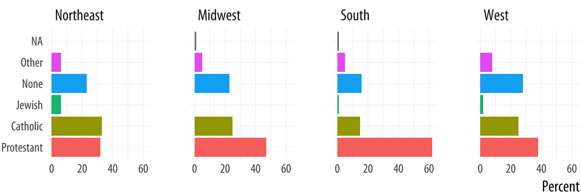
Figure 5.3: Religious preferences by Region, faceted version.
For most plots the coordinate system is cartesian, showing plots on a plane defined by an x-axis and a y-axis. The coord_cartesian() function manages this, but we don’t need to call it. The coord_flip() function switches the x and y axes after the plot is made. It does not remap variables to aesthetics. In this case, religion is still mapped to x and pct to y. Because the religion names do not need an axis label to be understood, we set x = NULL in the labs() call.
We will see more of what dplyr’s grouping and filtering operations can
do later. It is a flexible and powerful framework. For now, think of
it as a way to quickly summarize tables of data without having to
write code in the body of our ggplot() or geom_ functions.
5.2 Continuous variables by group or category
Let’s move to a new dataset, the organdata table. Like gapminder, it has a
country-year structure. It contains a little more than a decade’s
worth of information on the donation of organs for transplants in seventeen OECD
countries. The organ procurement rate is a measure of the number of human organs obtained from cadaver organ donors for use in transplant operations. Along with
this donation data, the dataset has a variety of numerical demographic
measures, and several categorical measures of health and welfare
policy and law. Unlike the gapminder data, some observations are
missing. These are designated with a value of NA, R’s standard code
for missing data. The organdata table is included in the socviz
library. Load it up and take a quick look. Instead of using head(),
for variety this time we will make a short pipeline to select the first six columns of
the dataset, and then pick five rows at random using a function called
sample_n(). This function takes two main arguments. First we provide the table of data we want
to sample from. Because we are using a pipeline, this is implicitly passed down from the beginning of the pipe. Then we supply the number of draws we want to make.Using numbers this way in select() chooses the numbered columns of the data frame. You can also select variable names directly.
organdata %>% select(1:6) %>% sample_n(size = 10)## # A tibble: 10 x 6
## country year donors pop pop_dens gdp
## <chr> <date> <dbl> <int> <dbl> <int>
## 1 Switzerland NA NA NA NA NA
## 2 Switzerland 1997-01-01 14.3 7089 17.2 27675
## 3 United Kingdom 1997-01-01 13.4 58283 24.0 22442
## 4 Sweden NA NA 8559 1.90 18660
## 5 Ireland 2002-01-01 21.0 3932 5.60 32571
## 6 Germany 1998-01-01 13.4 82047 23.0 23283
## 7 Italy NA NA 56719 18.8 17430
## 8 Italy 2001-01-01 17.1 57894 19.2 25359
## 9 France 1998-01-01 16.5 58398 10.6 24044
## 10 Spain 1995-01-01 27.0 39223 7.75 15720Lets’s start by naively graphing some of the data. We can take a look at a scatterplot of donors vs year.
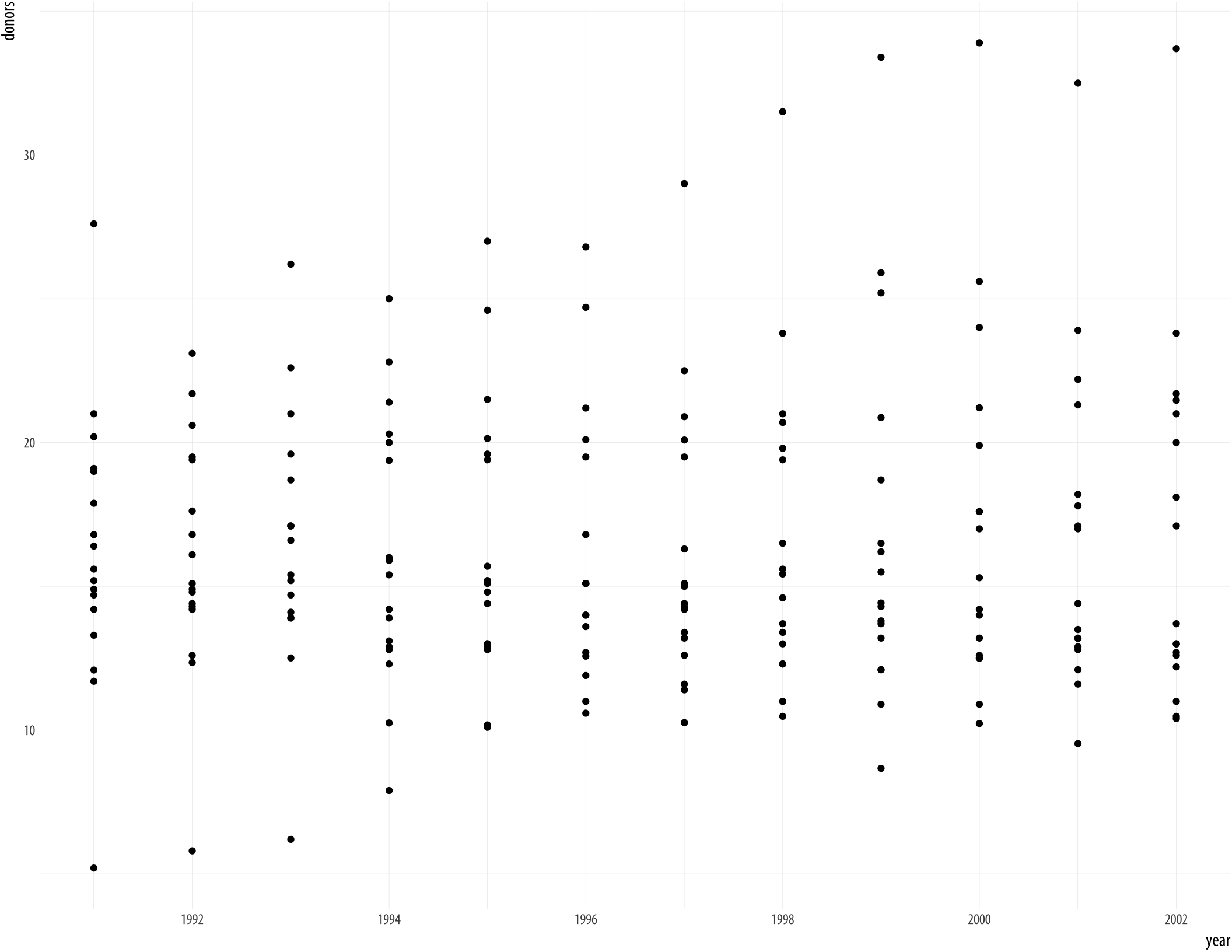 Figure 5.4: Not very informative.
p <- ggplot(data = organdata,
            mapping = aes(x = year, y = donors))
p + geom_point()
## Warning: Removed 34 rows containing missing values
## (geom_point).A message from ggplot warns you about the missing values. We’ll suppress this warning
from now on, so that it doesn’t clutter the output, but in general
it’s wise to read and understand the warnings that R gives, even when
code appears to run properly. If there are a large number of warnings,
R will collect them all and invite you to view them with the
warnings() function.
We could use geom_line() to plot each country’s time series, like we did with the gapminder data. To do that, remember, we need to tell ggplot what the grouping variable is. This time we can also facet the figure by country, as we do not have too many of them.
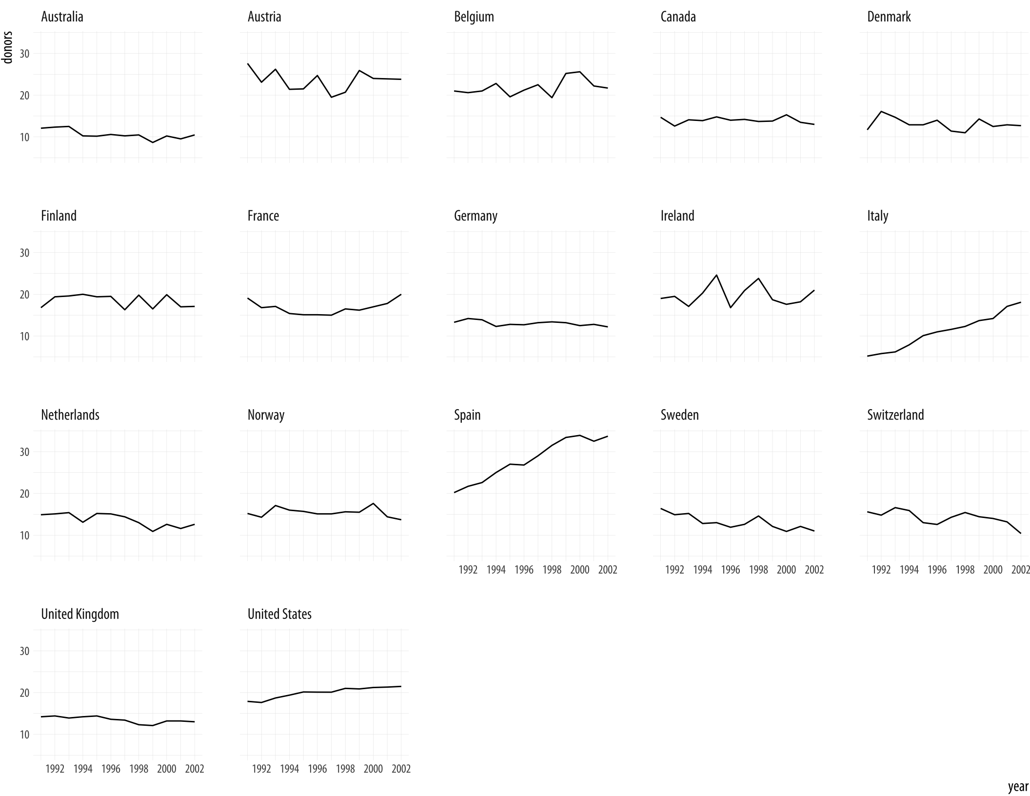 Figure 5.5: A faceted line plot.
p <- ggplot(data = organdata,
            mapping = aes(x = year, y = donors))
p + geom_line(aes(group = country)) + facet_wrap(~ country)
By default the facets are ordered alphabetically by country. We will see how to change this momentarily.
Let’s focus on the country-level variation, but without paying
attention to the time trend. We can use geom_boxplot() to get a
picture of variation by year across countries. Just as geom_bar() by
default calculates a count of observations by the category you map to
x, the stat_boxplot() function that works with geom_boxplot()
will calculate a number of statistics that allow the box and whiskers
to be drawn. We tell geom_boxplot() the variable we want to
categorize by (here, country) and the continuous variable we want
summarized (here, donors)
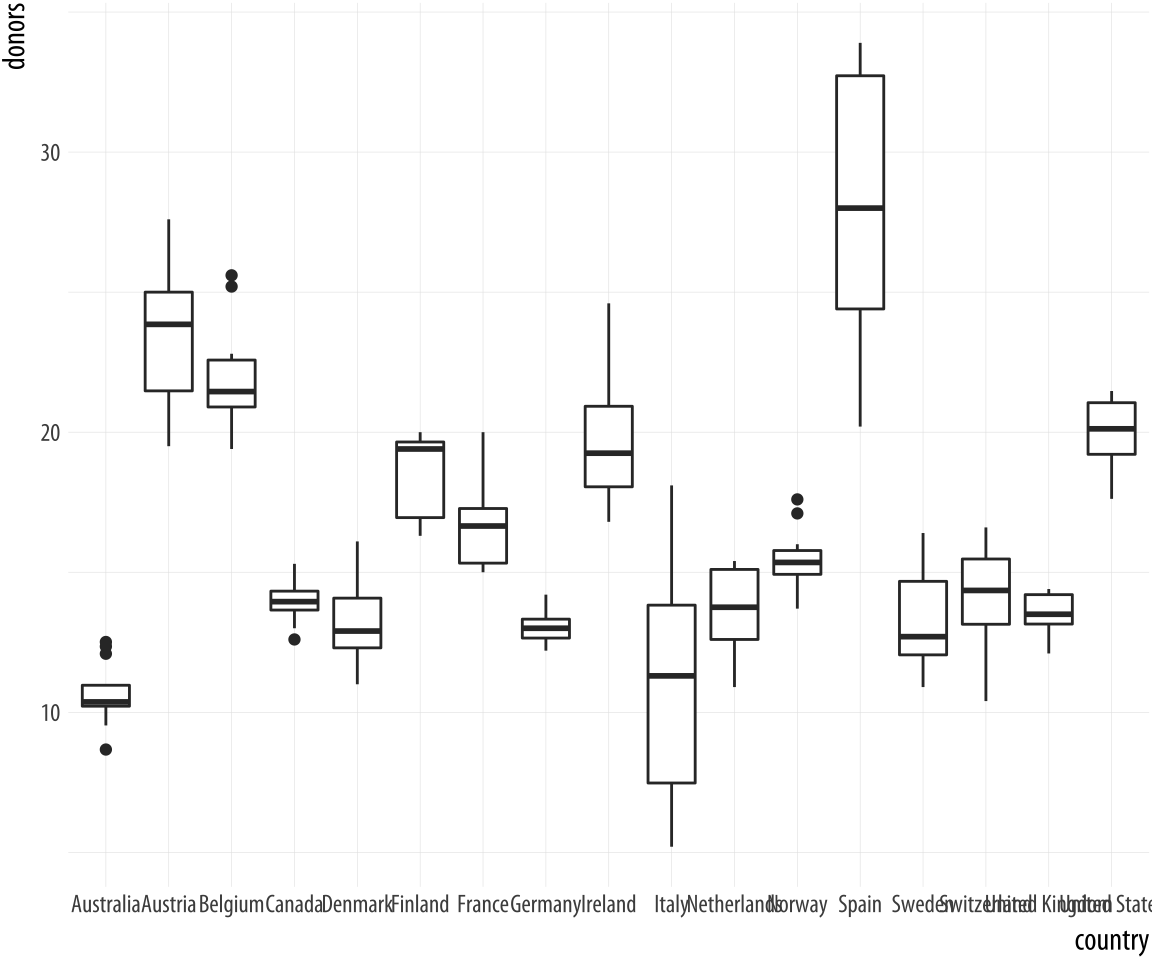 Figure 5.6: A first attempt at boxplots by country.
p <- ggplot(data = organdata,
            mapping = aes(x = country, y = donors))
p + geom_boxplot()
The boxplots look interesting but two issues could be addressed. First, as we saw in the previous chapter, it is awkward to have the country names on the x-axis because the labels will overlap. We use coord_flip() again to switch the axes (but not the mappings).
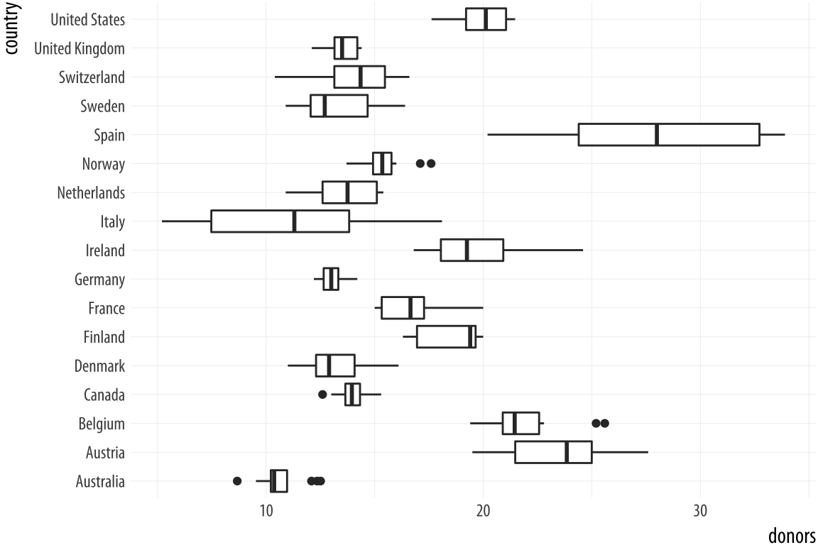 Figure 5.7: Moving the countries to the y-axis.
p <- ggplot(data = organdata,
            mapping = aes(x = country, y = donors))
p + geom_boxplot() + coord_flip()
That’s more legible but still not ideal. We generally want our plots to present data in some meaningful order. An obvious way is to have the countries listed from high to low average donation rate. We accomplish this by reordering the country variable by the mean of donors. The reorder() function will do this for us. It takes two required arguments. The first is the categorical variable or factor that we want to reorder. In this case, that’s country. The second is the variable we want to reorder it by. Here that is the donation rate, donors. The third and optional argument to reorder() is the function you want to use as a summary statistic. If you only give reorder() the first two required arguments, then by default it will reorder the categories of your first variable by the mean value of the second. You can name any sensible function you like to reorder the categorical variable (e.g., median, or sd). There is one additional wrinkle. In R, the default mean function will fail with an error if there are missing values in the variable you are trying to take the average of. You must say that it is OK to remove the missing values when calculating the mean. This is done by supplying the na.rm=TRUE argument to reorder(), which internally passes that argument on to mean(). We are reordering the variable we are mapping to the x aesthetic, so we use reorder() at that point in our code:
p <- ggplot(data = organdata,
            mapping = aes(x = reorder(country, donors, na.rm=TRUE),
                          y = donors))
p + geom_boxplot() +
    labs(x=NULL) +
    coord_flip()
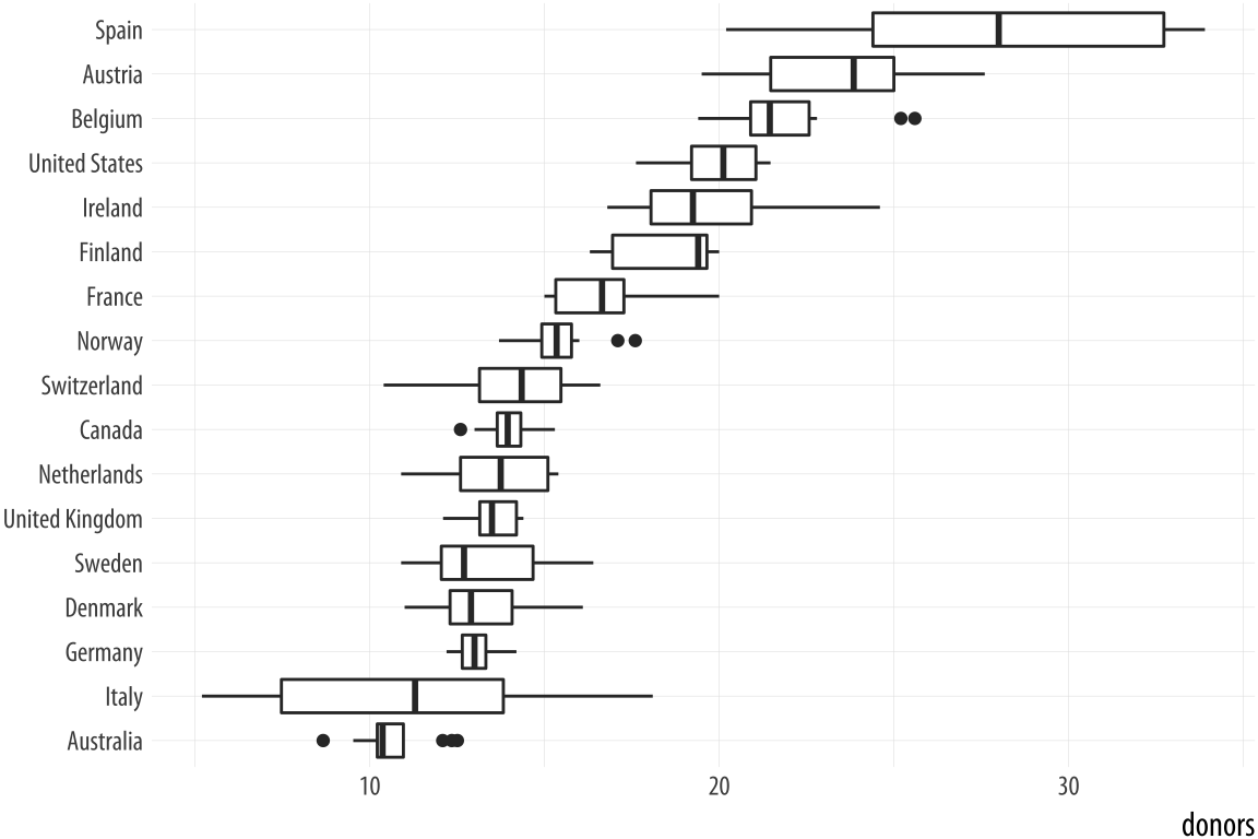 Figure 5.8: Boxplots reordered by mean donation rate.
Because it’s obvious what the country names are, in the labs() call we set their axis label to empty with labs(x=NULL). Ggplot offers some variants on the basic boxplot, including the violin plot. Try it with geom_violin(). There are also numerous arguments that control the finer details of the boxes and whiskers, including their width. Boxplots can also take color and fill aesthetic mappings like other geoms.
p <- ggplot(data = organdata,
            mapping = aes(x = reorder(country, donors, na.rm=TRUE),
                          y = donors, fill = world))
p + geom_boxplot() + labs(x=NULL) +
    coord_flip() + theme(legend.position = "top")
Figure 5.9: A boxplot with the fill aesthetic mapped.
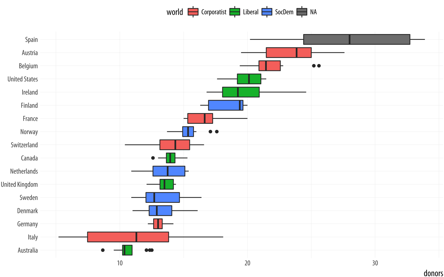
Putting categorical variables on the y-axis to compare their distributions is a very useful trick. Its makes it easy to effectively present summary data on more categories. The plots can be quite compact and fit a relatively large number of cases in by row. The approach also has the advantage of putting the variable being compared onto the x-axis, which sometimes makes it easier to compare across categories. If the number of observations within each categoriy is relatively small, we can skip (or supplement) the boxplots and show the individual observations, too. In this next example we map the world variable to color instead of fill as the default geom_point() plot shape has a color attribute, but not a fill.
 Figure 5.10: Using points instead of a boxplot.
p <- ggplot(data = organdata,
            mapping = aes(x = reorder(country, donors, na.rm=TRUE),
                          y = donors, color = world))
p + geom_point() + labs(x=NULL) +
    coord_flip() + theme(legend.position = "top")
When we use geom_point() like this, there is some overplotting of observations. In these cases, it can be useful to perturb the data just a little bit in order to get a better sense of how many observations there are at different values. We use geom_jitter() to do this. This geom works much like geom_point(), but randomly nudges each observation by a small amount.
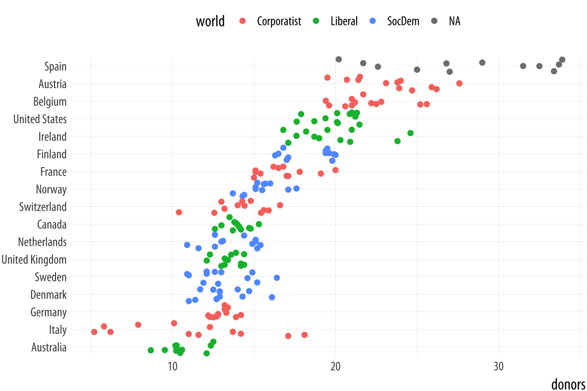 Figure 5.11: Jittering the points.
p <- ggplot(data = organdata,
            mapping = aes(x = reorder(country, donors, na.rm=TRUE),
                          y = donors, color = world))
p + geom_jitter() + labs(x=NULL) +
    coord_flip() + theme(legend.position = "top")
The default amount of jitter is a little too much for our purposes. We can control it using height and width arguments to a position_jitter() function within the geom. Because we’re making a one-dimensional summary here, we just need width.Can you see why we did not use height? If not, try it and see what happens.
p <- ggplot(data = organdata,
            mapping = aes(x = reorder(country, donors, na.rm=TRUE),
                          y = donors, color = world))
p + geom_jitter(position = position_jitter(width=0.15)) +
    labs(x=NULL) + coord_flip() + theme(legend.position = "top")
Figure 5.12: A jittered plot.

When we want to summarize a categorical variable that just has one point per category, we should use this approach as well. The result will be a Cleveland dotplot, a simple and extremely effective method of presenting data that is usually better than either a bar chart or a table. For example, we can make a Cleveland dotplot of the average donation rate.
This also gives us another opportunity to do a little bit of data
munging with a dplyr pipeline. We will use one to aggregate our larger
country-year data frame to a smaller table of summary statistics by
country. There is more than one way to do pipeline this task. We could
choose the variables we want to summarize and then repeatedly use the
mean() and sd() functions to calculate the means and standard
deviations of the variables we want. We will again use the pipe
operator, %>%, to do our work:
by_country <- organdata %>% group_by(consent_law, country) %>%
    summarize(donors_mean= mean(donors, na.rm = TRUE),
              donors_sd = sd(donors, na.rm = TRUE),
              gdp_mean = mean(gdp, na.rm = TRUE),
              health_mean = mean(health, na.rm = TRUE),
              roads_mean = mean(roads, na.rm = TRUE),
              cerebvas_mean = mean(cerebvas, na.rm = TRUE))
The pipeline consists of two steps. First we group the data by consent_law and country, and then use summarize() to create six new variables, each one of which is the mean or standard deviation of each country’s score on a corresponding variable in the original organdata data frame.For an alternative view, change country to year in the grouping statement and see what happens.
As usual, summarize() step, will inherit information about the
original data and the grouping, and then do its calculations at the
innermost grouping level. In this case it takes all the observations
for each country and calculates the mean or standard deviation as
requested. Here is what the resulting object looks like:
by_country## # A tibble: 17 x 8
## # Groups: consent_law [?]
## consent_law country donors_mean donors_sd gdp_mean health_mean roads_mean cerebvas_mean
## <chr> <chr> <dbl> <dbl> <dbl> <dbl> <dbl> <dbl>
## 1 Informed Australia 10.6 1.14 22179 1958 105 558
## 2 Informed Canada 14.0 0.751 23711 2272 109 422
## 3 Informed Denmark 13.1 1.47 23722 2054 102 641
## 4 Informed Germany 13.0 0.611 22163 2349 113 707
## 5 Informed Ireland 19.8 2.48 20824 1480 118 705
## 6 Informed Netherlands 13.7 1.55 23013 1993 76.1 585
## 7 Informed United Kingdom 13.5 0.775 21359 1561 67.9 708
## 8 Informed United States 20.0 1.33 29212 3988 155 444
## 9 Presumed Austria 23.5 2.42 23876 1875 150 769
## 10 Presumed Belgium 21.9 1.94 22500 1958 155 594
## 11 Presumed Finland 18.4 1.53 21019 1615 93.6 771
## 12 Presumed France 16.8 1.60 22603 2160 156 433
## 13 Presumed Italy 11.1 4.28 21554 1757 122 712
## 14 Presumed Norway 15.4 1.11 26448 2217 70.0 662
## 15 Presumed Spain 28.1 4.96 16933 1289 161 655
## 16 Presumed Sweden 13.1 1.75 22415 1951 72.3 595
## 17 Presumed Switzerland 14.2 1.71 27233 2776 96.4 424As before, the variables specified in group_by() are retained in the
new data frame, the variables created with summarize() are added,
and all the other variables in the original data are dropped. The
countries are also summarized alphabetically within consent_law,
which was the outermost grouping variable in the group_by()
statement at the start of the pipeline.
Using our pipeline this way is reasonable, but the code is worth looking at again. For one thing, we have to repeatedly type out the names of the mean() and sd() functions and give each of them the name of the variable we want summarized and the na.rm = TRUE argument each time to make sure the functions don’t complain about missing values. We also repeatedly name our new summary variables in the same way, by adding _mean or _sd to the end of the original variable name. If we wanted to calculate the mean and standard deviation for all the numerical variables in organdata, our code would get even longer. Plus, in this version we lose the other, time-invariant categorical variables that we haven’t grouped by, such as world. When we see repeated actions like this in our code, we can ask whether there’s a better way to proceed.
There is. What we would like to do is apply the mean() and sd() functions to every numerical variable in organdata, but only the numerical ones. Then we want to name the results in a consistent way, and return a summary table including all the categorical variables like world. We can create a better version of the by_country object using a little bit of R’s functional programming abilities. Here is the code:
by_country <- organdata %>% group_by(consent_law, country) %>%
    summarize_if(is.numeric, funs(mean, sd), na.rm = TRUE) %>%
    ungroup()
The pipeline starts off just as before, taking organdata and then grouping it by consent_law and country. In the next step, though, instead of manually taking the mean and standard deviation of a subset of variables, we use the summarize_if() function instead. As its name suggests, it examines each column in our data and applies a test to it. It only summarizes if the test is passed, that is, if it returns a value of TRUE.We do not have to use parentheses when naming the functions inside summarize_if(). Here the test is the function is.numeric(), which looks to see if a vector is a numeric value or not. If it is, then summarize_if() will apply the summary function or functions we want to organdata. Because we are taking both the mean and the standard deviation, we use funs() to list the functions we want to use. And we finish with the na.rm = TRUE argument, which will be passed on to each use of both mean() and sd(). In the last step in the pipeline we ungroup() the dataSometimes graphing functions can get confused by grouped tibbles where we don’t explicitly use the groups in the plot., so that the result is a plain tibble.
Here is what the pipeline returns:
by_country ## # A tibble: 17 x 28
## consent_law country donors_mean pop_mean pop_dens_mean gdp_mean gdp_lag_mean health_mean
## <chr> <chr> <dbl> <dbl> <dbl> <dbl> <dbl> <dbl>
## 1 Informed Australia 10.6 18318 0.237 22179 21779 1958
## 2 Informed Canada 14.0 29608 0.297 23711 23353 2272
## 3 Informed Denmark 13.1 5257 12.2 23722 23275 2054
## 4 Informed Germany 13.0 80255 22.5 22163 21938 2349
## 5 Informed Ireland 19.8 3674 5.23 20824 20154 1480
## 6 Informed Netherlands 13.7 15548 37.4 23013 22554 1993
## 7 Informed United Kingdom 13.5 58187 24.0 21359 20962 1561
## 8 Informed United States 20.0 269330 2.80 29212 28699 3988
## 9 Presumed Austria 23.5 7927 9.45 23876 23415 1875
## 10 Presumed Belgium 21.9 10153 30.7 22500 22096 1958
## 11 Presumed Finland 18.4 5112 1.51 21019 20763 1615
## 12 Presumed France 16.8 58056 10.5 22603 22211 2160
## 13 Presumed Italy 11.1 57360 19.0 21554 21195 1757
## 14 Presumed Norway 15.4 4386 1.35 26448 25769 2217
## 15 Presumed Spain 28.1 39666 7.84 16933 16584 1289
## 16 Presumed Sweden 13.1 8789 1.95 22415 22094 1951
## 17 Presumed Switzerland 14.2 7037 17.0 27233 26931 2776
## # ... with 20 more variables: health_lag_mean <dbl>, pubhealth_mean <dbl>, roads_mean <dbl>,
## # cerebvas_mean <dbl>, assault_mean <dbl>, external_mean <dbl>, txp_pop_mean <dbl>,
## # donors_sd <dbl>, pop_sd <dbl>, pop_dens_sd <dbl>, gdp_sd <dbl>, gdp_lag_sd <dbl>,
## # health_sd <dbl>, health_lag_sd <dbl>, pubhealth_sd <dbl>, roads_sd <dbl>, cerebvas_sd <dbl>,
## # assault_sd <dbl>, external_sd <dbl>, txp_pop_sd <dbl>All the numeric variables have been summarized. They are named using
the original variable, with the function’s name appended:
donors_mean and donors_sd, and so on. This is a compact way to rapidly transform our data in various ways. There is a family of summarize_ functions for various tasks, and a complementary group of mutate_ functions for when we want to add columns to the data rather than aggregated it.
With our data summarized by country, we can draw a dotplot with
geom_point(). Let’s also color the results by the consent law for
each country.
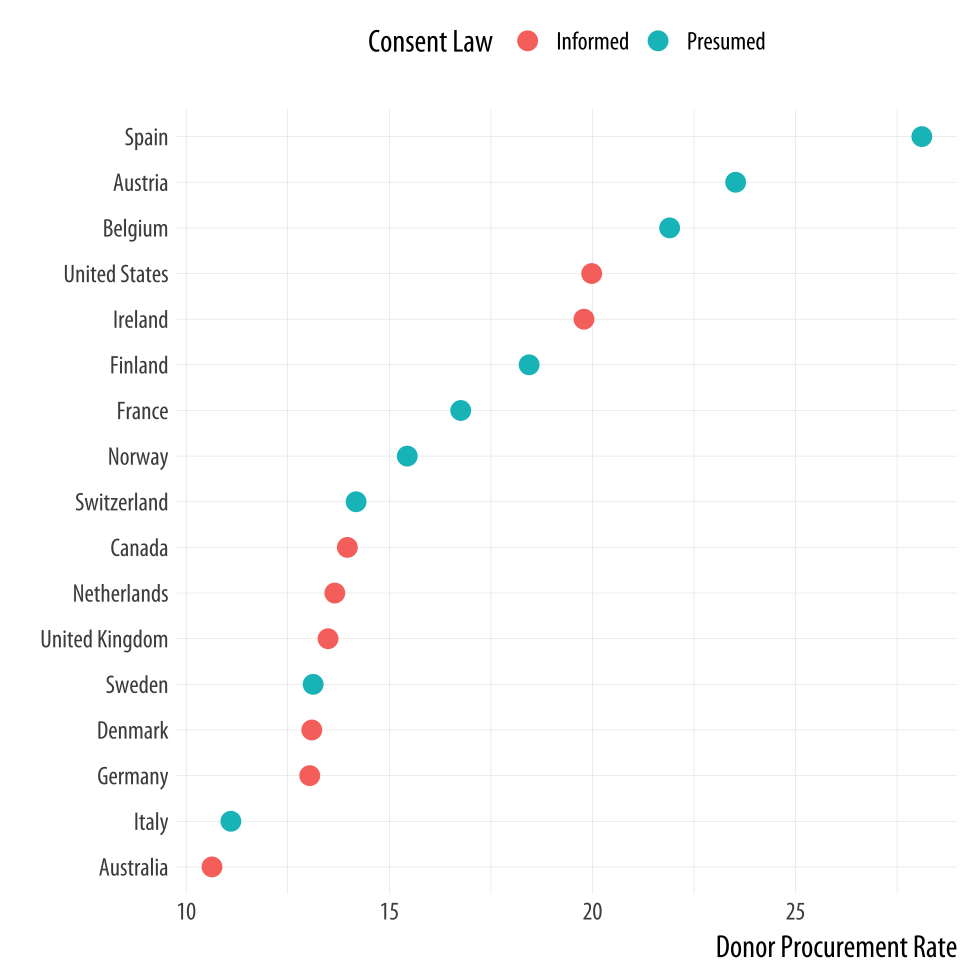 Figure 5.13: A Cleveland dotplot, with colored points.
p <- ggplot(data = by_country,
            mapping = aes(x = donors_mean, y = reorder(country, donors_mean),
                          color = consent_law))
p + geom_point(size=3) +
    labs(x = "Donor Procurement Rate",
         y = "", color = "Consent Law") +
    theme(legend.position="top")
Alternatively, if we liked, we could use a facet instead of coloring
the points. Using facet_wrap() we can split the consent_law
variable into two panels, and then rank the countries by donation rate
within each panel. Because we have a categorical variable on our
y-axis, there are two wrinkles worth noting. First, if we leave
facet_wrap() to its defaults, the panels will be plotted side by
side. This will make it difficult to compare the two groups on the
same scale. Instead the plot will be read left to right, which is not
useful. To avoid this, we will have the panels appear one on top of
the other by saying we only want toq have one column. This is the
ncol=1 argument. Second, and again because we have a categorical
variable on the y-axis, the default facet plot will have the names of
every country appear on the y-axis of both panels. (Were the y-axis a
continuous variable this would be the what we would want.) In that
case, only half the rows in each panel of our plot will have points in
them.
To avoid this we allow the y-axes scale to be free. This is the
scales="free_y" argument. Again, for faceted plots where both
variables are continuous, we generally do not want the scales to be
free, because it allows the x- or y-axis for each panel to vary with
the range of the data inside that panel only, instead of the range
across the whole dataset. Ordinarily, the point of small-multiple
facets is to be able to compare across the panels. This means free
scales are usually not a good idea, because each panel gets its own x-
or y-axis range, which breaks comparability. But where one axis is
categorical, as here, we can free the categorical axis and leave the
continuous one fixed. The result is that each panel shares the same
x-axis, and it is easy to compare between them.
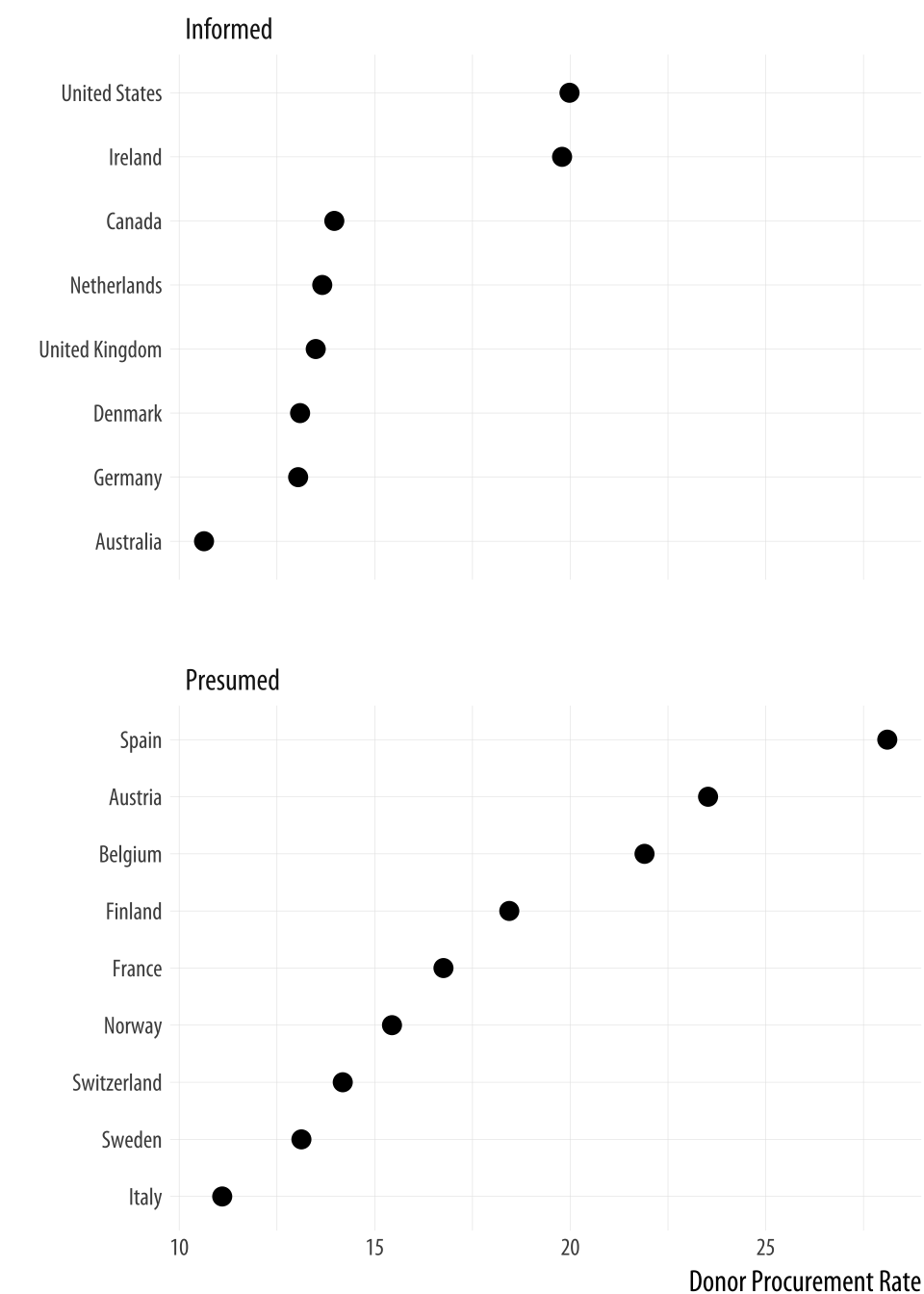 Figure 5.14: A faceted dotplot with free scales on the y-axis.
p <- ggplot(data = by_country,
            mapping = aes(x = donors_mean,
                          y = reorder(country, donors_mean)))

p + geom_point(size=3) +
    facet_wrap(~ consent_law, scales = "free_y", ncol = 1) +
    labs(x= "Donor Procurement Rate",
         y= "")
Cleveland dotplots are generally preferred to bar or column charts.
When making them, put the categories on the y-axis and order them in
the way that is most relevant to the numerical summary you are
providing. This sort of plot is also an excellent way to summarize
model results or any data with with error ranges. We use
geom_point() to draw our dotplots. There is a geom called
geom_dotplot(), but it is designed to produce a different sort of
figure. It is a kind of histogram, with individual observations represented
by dots that are then stacked on top of one another to show how many
of them there are.
The Cleveland-style dotplot can be extended to cases where we want to
include some information about variance or error in the plot. Using
geom_pointrange(), we can tell ggplot to show us a point estimate
and a range around it. Here we will use the standard deviation of the
donation rate that we calculated above. But this is also the natural
way to present, for example, estimates of model coefficients with
confidence intervals. With geom_pointrange() we map our x and y
variables as usual, but the function needs a little more information
than geom_point. It needs to know the range of the line to draw on
either side of the point, defined by the arguments ymax and ymin.
This is given by the y value (donors_mean) plus or minus its standard
deviation (donors_sd). If a function argument expects a number, it is
OK to give it a mathematical expression that resolves to the number
you want. R will calculate the result for you.
p <- ggplot(data = by_country, mapping = aes(x = reorder(country,
              donors_mean), y = donors_mean))

p + geom_pointrange(mapping = aes(ymin = donors_mean - donors_sd,
       ymax = donors_mean + donors_sd)) +
     labs(x= "", y= "Donor Procurement Rate") + coord_flip()
Figure 5.15: A dot-and-whisker plot, with the range defined by the standard deviation of the measured variable.
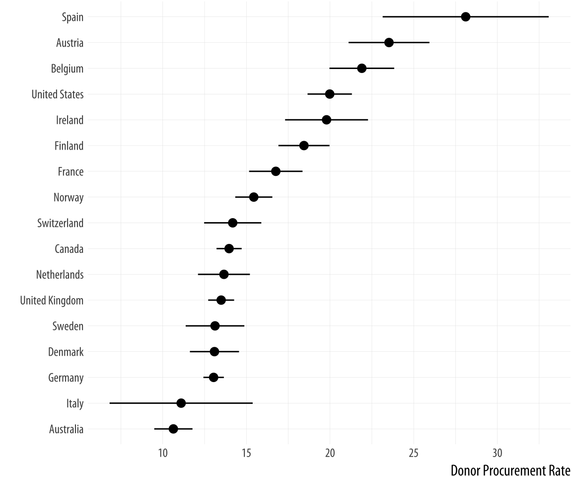
Because geom_pointrange() expects y, ymin, and ymax as arguments, we map donors_mean to y and the ccode variable to x, then flip the axes at the end with coord_flip().
5.3 Plot text directly
It can sometimes be useful to plot the labels along with the points in a scatterplot, or just plot informative labels directly. We can do this with geom_text().
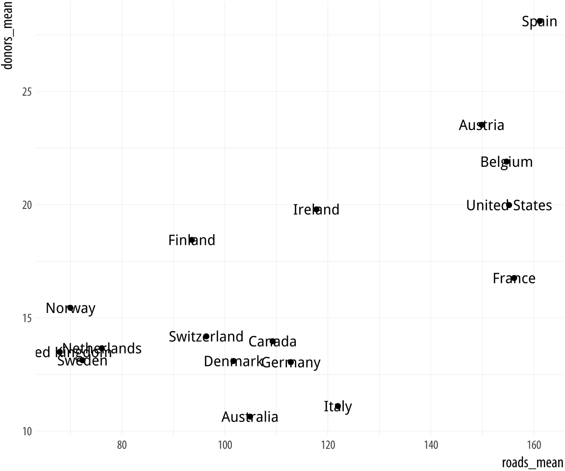 Figure 5.16: Plotting labels and text.
p <- ggplot(data = by_country,
            mapping = aes(x = roads_mean, y = donors_mean))
p + geom_point() + geom_text(mapping = aes(label = country))
The text is plotted right on top of the points, because both are positioned using the same x and y mapping. One way of dealing with this, often the most effective if we are not too worried about excessive precision in the graph, is to remove the points by dropping geom_point() from the plot. A second option is to adjust the position of the text. We can left- or right-justify the labels using the hjust argument to geom_text(). Setting hjust=0 will left justify the label, and hjust=1 will right justify it.
p <- ggplot(data = by_country,
            mapping = aes(x = roads_mean, y = donors_mean))

p + geom_point() + geom_text(mapping = aes(label = country), hjust = 0)
You might be tempted to try different values to hjust to fine-tune your labels. But this is not a robust approach. It will often fail because the space is added in proportion to the length of the label. The result is that longer labels move further away from their points than you want. There are ways around this, but they introduce other problems.
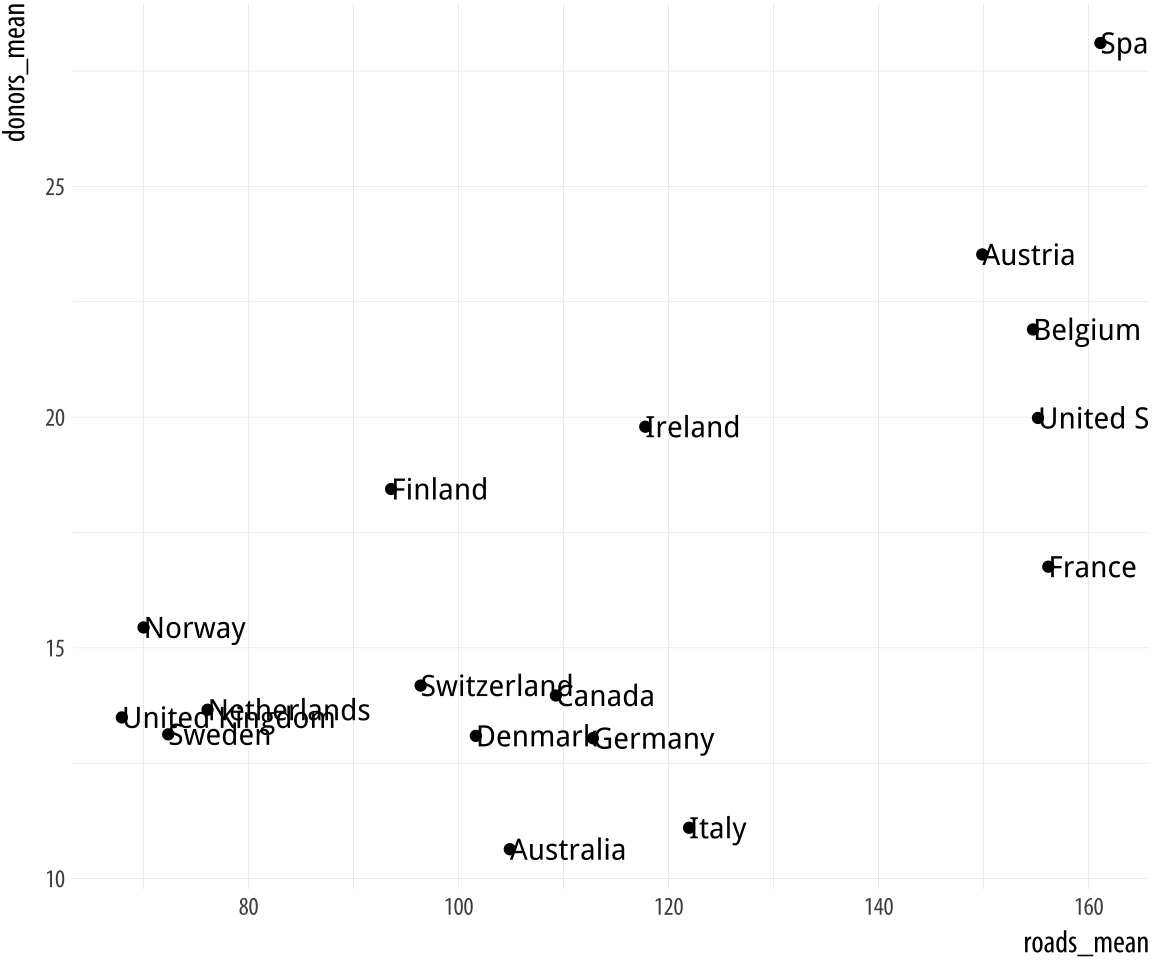 Figure 5.17: Plot points and text labels, with a horizontal position adjustment.
Instead of wrestling any further with geom_text(), we will use ggrepel instead. This very useful library adds some new geoms to ggplot. Just as ggplot extends the plotting capabilities of R, there are many small libraries that extend the capabilities of ggplot, often by providing some new type of geom. The ggrepel library provides geom_text_repel() and geom_label_repel(), two geoms that can pick out labels much more flexibly than the default geom_text(). First, make sure the library is installed, then load it in the usual way:
library(ggrepel)We will use geom_text_repel() instead of geom_text(). To demonstrate some of what geom_text_repel() can do, we will switch datasets and work with some historical U.S. presidential election data provided in the socviz library.
elections_historic %>% select(2:7) ## # A tibble: 49 x 6
## year winner win_party ec_pct popular_pct popular_margin
## <int> <chr> <chr> <dbl> <dbl> <dbl>
## 1 1824 John Quincy Adams D.-R. 0.322 0.309 -0.104
## 2 1828 Andrew Jackson Dem. 0.682 0.559 0.122
## 3 1832 Andrew Jackson Dem. 0.766 0.547 0.178
## 4 1836 Martin Van Buren Dem. 0.578 0.508 0.142
## 5 1840 William Henry Harrison Whig 0.796 0.529 0.0605
## 6 1844 James Polk Dem. 0.618 0.495 0.0145
## 7 1848 Zachary Taylor Whig 0.562 0.473 0.0479
## 8 1852 Franklin Pierce Dem. 0.858 0.508 0.0695
## 9 1856 James Buchanan Dem. 0.588 0.453 0.122
## 10 1860 Abraham Lincoln Rep. 0.594 0.396 0.101
## # ... with 39 more rowsp_title <- "Presidential Elections: Popular & Electoral College Margins"
p_subtitle <- "1824-2016"
p_caption <- "Data for 2016 are provisional."
x_label <- "Winner's share of Popular Vote"
y_label <- "Winner's share of Electoral College Votes"
p <- ggplot(elections_historic, aes(x = popular_pct, y = ec_pct,
label = winner_label))
p + geom_hline(yintercept = 0.5, size = 1.4, color = "gray80") +
geom_vline(xintercept = 0.5, size = 1.4, color = "gray80") +
geom_point() +
geom_text_repel() +
scale_x_continuous(labels = scales::percent) +
scale_y_continuous(labels = scales::percent) +
labs(x = x_label, y = y_label, title = p_title, subtitle = p_subtitle,
caption = p_caption)Figure 5.18 takes each U.S. presidential election since 1824 (the first year that the size of the popular vote was recorded), and plots the winner’s share of the popular vote against the winner’s share of the electoral college vote. The shares are stored in the data as proportions (from 0 to 1) rather than percentages, so we need to adjust the labels of the scales using scale_x_continuous() and scale_y_continuous(). Seeing as we are interested in particular presidencies, we also want to label the points. ButNormally it is not a good idea to label every point on a plot in the way we do here. A better approach might be to select a few points of particular interest. because many of the data points are plotted quite close together we need to make sure the labels do not overlap with each other, or obscure other points. The geom_text_repel() function handles the problem very well. This plot has relatively long labels. We could put them directly in the code, but just to keep things a bit tidier we assign the text to some named objects instead. Then we use those in the plot formula.
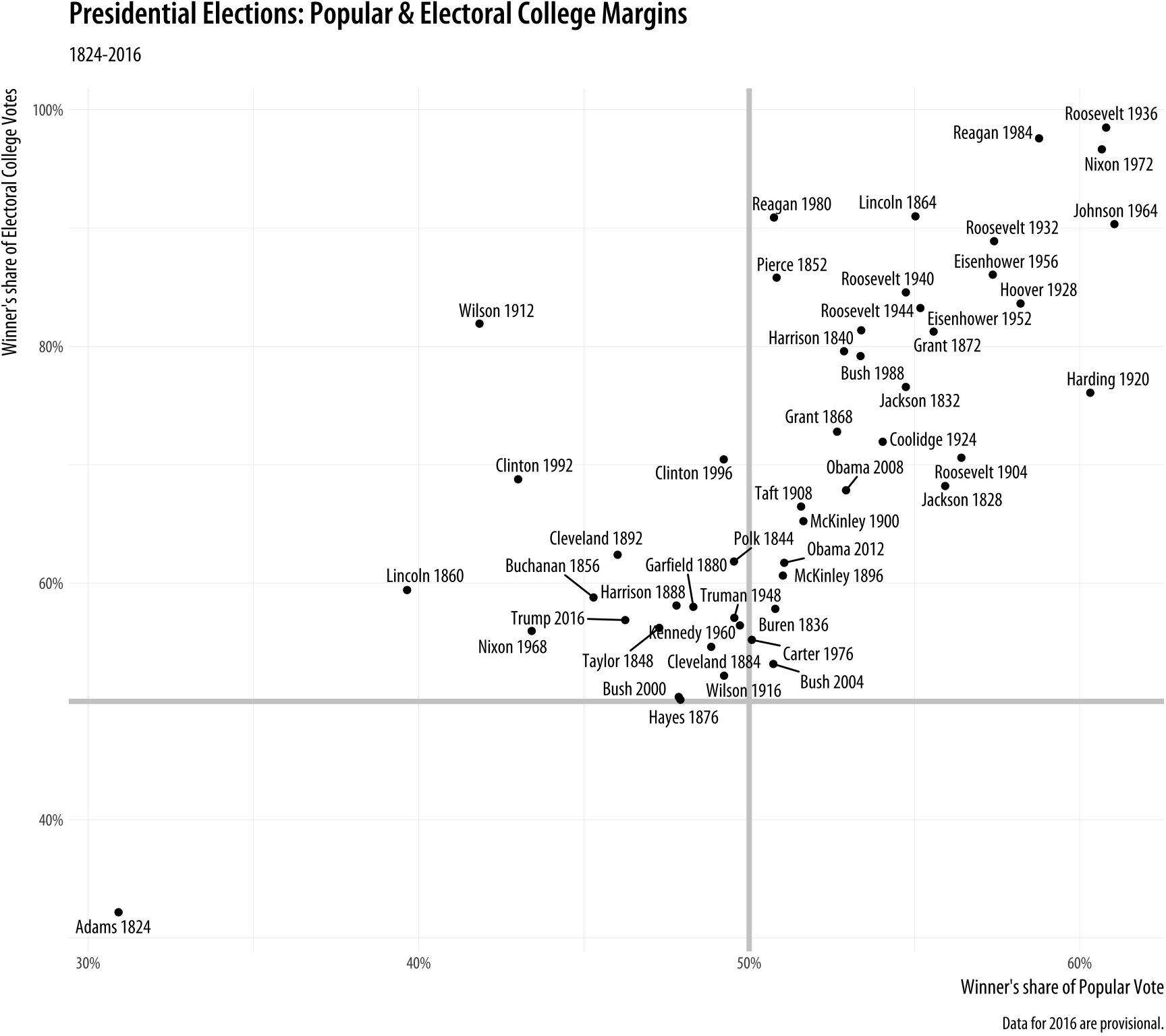
Figure 5.18: Text labels with ggrepel.
In this plot, what is of interest about any particular point is the
quadrant of the x-y plane each point it is in, and how far away it is
from the fifty percent threshold on both the x-axis (with the popular
vote share) and the y-axis (with the electoral college vote share). To
underscore this point we draw two reference lines at the fifty percent
line in each direction. They are drawn at the beginning of the plotting process so that the points and labels can be layered on top of them. We use two new geoms, geom_hline() and geom_vline() to make the lines. They take yintercept and xintercept arguments, respectively, and the lines can also be sized
and colored as you please. There is also a geom_abline() geom that
draws straight lines based on a supplied slope and intercept. This is
useful for plotting, for example, 45 degree reference lines in scatterplots.
The ggrepel package has several other useful geoms and options to aid with effectively plotting labels along with points. The performance of its labeling algorithm is consistently very good. For many purposes it will be a better first choice than geom_text().
5.4 Label outliers
Sometimes we want to pick out some points of interest in the data
without labeling every single item. We can still use geom_text() or
geom_text_repel(). We just need to pick out the points we want to
label. In the code above, we do this on the fly by telling
geom_text_repel() to use a different data set from the one
geom_point() is using. We do this using the subset() function.
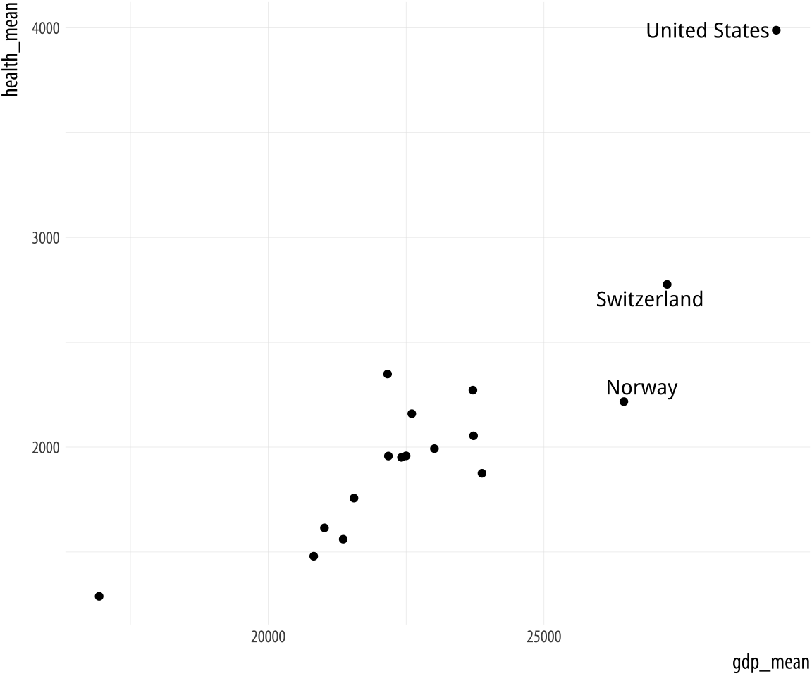
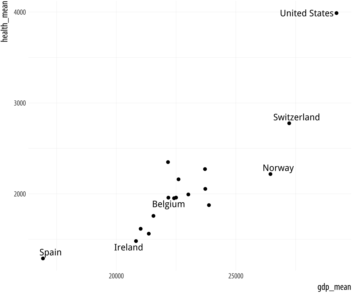 Figure 5.19: Top: Labeling text according to a single criterion. Bottom: Labeling according to several criteria.
p <- ggplot(data = by_country,
            mapping = aes(x = gdp_mean, y = health_mean))

p + geom_point() +
    geom_text_repel(data = subset(by_country, gdp_mean > 25000),
                    mapping = aes(label = country))

p <- ggplot(data = by_country,
            mapping = aes(x = gdp_mean, y = health_mean))

p + geom_point() +
    geom_text_repel(data = subset(by_country,
                                  gdp_mean > 25000 | health_mean < 1500 |
                                  country %in% "Belgium"),
                    mapping = aes(label = country))
In the first figure, we specify a new data argument to the text
geom, and use subset() to create a small dataset on the fly. The
subset() function takes the by_country object and selects only the
cases where gdp_mean is over 25,000, with the result that only those
points are labeled in the plot. The criteria we use can be whatever we
like, as long as we can write a logical expression that defines it.
For example, in the lower figure we pick out cases where gdp_mean is
greater than 25,000, or health_mean is less than 1,500, or the
country is Belgium. In all of these plots, because we are using
geom_text_repel(), we no longer have to worry about our earlier
problem where the country labels were clipped at the edge of the plot.
Alternatively, we can pick out specific points by creating a dummy variable in the data set just for this purpose. Here we add a column to organdata called ind. An observation gets coded as TRUE if ccode is “Ita”, or “Spa”, and if the year is greater than 1998. We use this new ind variable in two ways in the plotting code. First, we map it to the color aesthetic in the usual way. Second, we use it to subset the data that the text geom will label. Then we suppress the legend that would otherwise appear for the label and color aesthetics by using the guides() function.
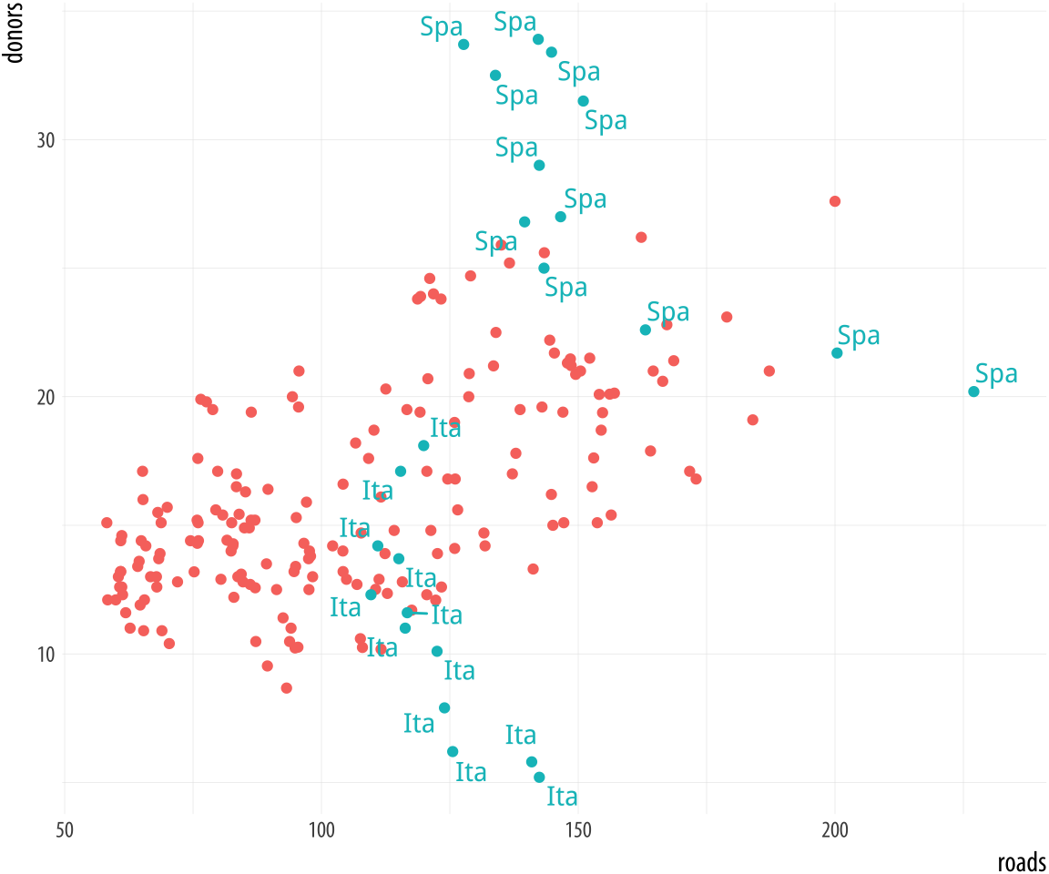 Figure 5.20: Labeling using a dummy variable.
organdata$ind <- organdata$ccode %in% c("Ita", "Spa") &
                    organdata$year > 1998

p <- ggplot(data = organdata,
            mapping = aes(x = roads,
                          y = donors, color = ind))
p + geom_point() +
    geom_text_repel(data = subset(organdata, ind),
                    mapping = aes(label = ccode)) +
    guides(label = FALSE, color = FALSE)
5.5 Write and draw in the plot area
Sometimes we want to annotate the figure directly. Maybe we need to
point out something important that is not mapped to a variable. We use
annotate() for this purpose. It isn’t quite a geom, as it doesn’t
accept any variable mappings from our data. Instead, it can use
geoms, temporarily taking advantage of their features in order to
place something on the plot. The most obvious use-case is putting
arbitrary text on the plot.
We will tell annotate() to use a text geom. It hands the plotting
duties to geom_text(), which means that we can use all of that geom’s
arguments in the annotate() call. This includes the x, y, and label
arguments, as one would expect, but also things like size, color, and
the hjust and vjust settings that allow text to be justified. This is
particularly useful when our label has several lines in it. We include
extra lines by using the special “newline” code, \n, which we use
instead of a space to force a line-break as needed.
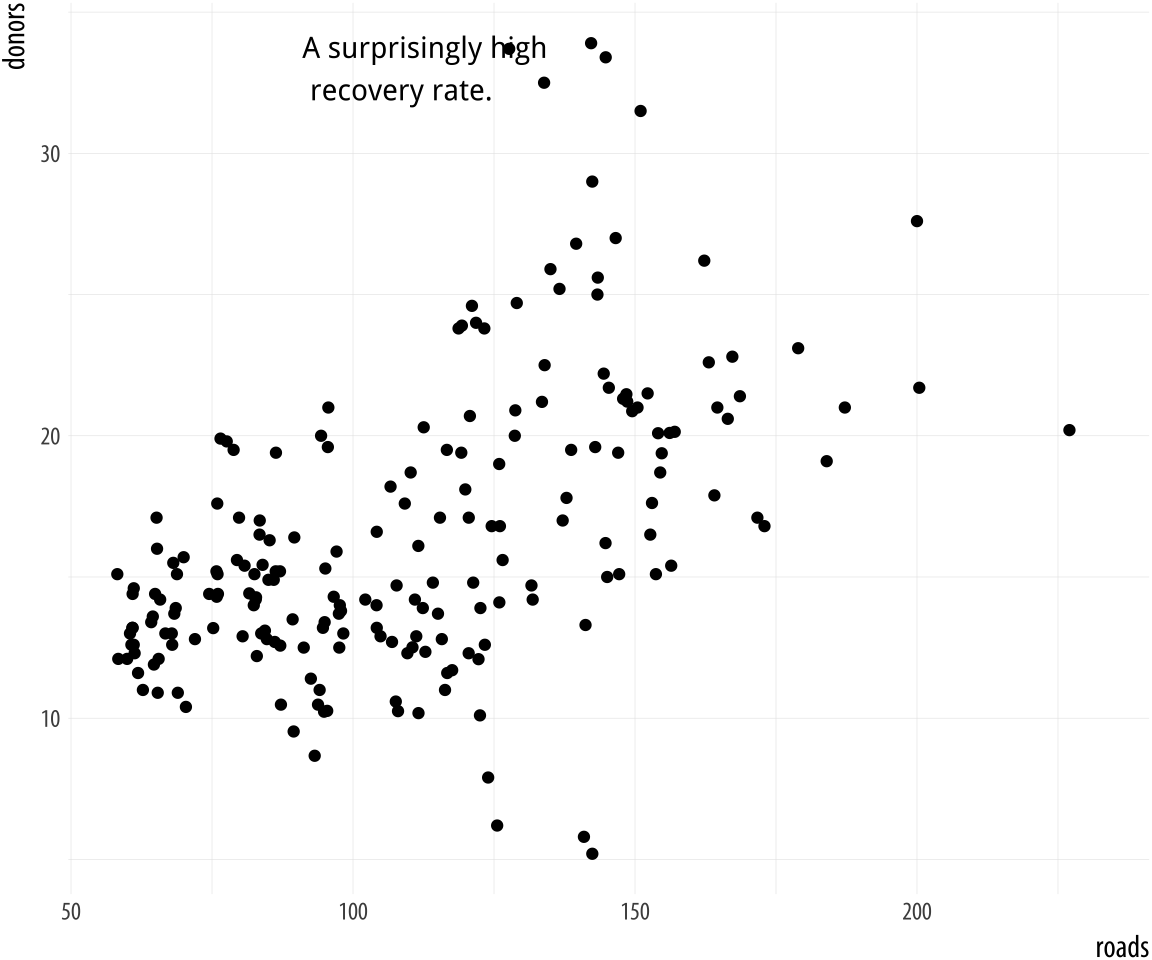 Figure 5.21: Arbitrary text with
 annotate().
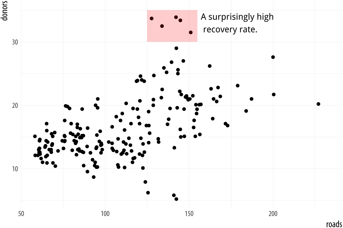
p <- ggplot(data = organdata, mapping = aes(x = roads, y = donors))
p + geom_point() + annotate(geom = "text", x = 91, y = 33,
                            label = "A surprisingly high \n recovery rate.",
                            hjust = 0)
The annotate() function can work with other geoms, too. Use it to
draw rectangles, line segments, and arrows. Just remember to pass
along the right arguments to the geom you use. We can add a rectangle
to this plot, for instance, with a second call to the function.
p <- ggplot(data = organdata,
            mapping = aes(x = roads, y = donors))
p + geom_point() +
    annotate(geom = "rect", xmin = 125, xmax = 155,
             ymin = 30, ymax = 35, fill = "red", alpha = 0.2) +
    annotate(geom = "text", x = 157, y = 33,
             label = "A surprisingly high \n recovery rate.", hjust = 0)
Figure 5.22: Using two different geoms with annotate().
5.6 Understanding scales, guides, and themes
This chapter has gradually extended our ggplot vocabulary in two ways. First, we introduced some new geom_ functions that allowed us to draw new kinds of plots. Second, we made use of new functions controlling some aspects of the appearance of our graph. We used scale_x_log10(), scale_x_continuous() and other scale_ functions to adjust axis labels. We used the guides() function to remove the legends for a color mapping and a label mapping. And we also used the theme() function to move the position of a legend from the side to the top of a figure.
Learning about new geoms extended what we have seen already. Each geom makes a different type of plot. Different plots require different mappings in order to work, and so each geom_ function takes mappings tailored to the kind of graph it draws. You can’t use geom_point() to make a scatterplot without supplying an x and a y mapping, for example. Using geom_histogram() only requires you to supply an x mapping. Similarly, geom_pointrange() requires ymin and ymax mappings in order to know where to draw the lineranges it makes. A geom_ function may take optional arguments, too. When using geom_boxplot() you can specify what the outliers look like using arguments like outlier.shape and outlier.color.
The second kind of extension introduced some new functions, and with them some new concepts. What are the differences between the scale_ functions, the guides() function, and the theme() function? When do you know to use one rather than the other? Why are there so many scale_ functions listed in the online help, anyway? How can you tell which one you need?
Here is a rough and ready starting point:
- Every aesthetic mapping has a scale. If you want to adjust how that scale is marked or graduated, then you use a
scale_function. - Many scales come with a legend or key to help the reader interpret the graph. These are called guides. You can make adjustments to them with the
guides()function. Perhaps the most common use case is to make the legend disappear, as it is sometimes superfluous. Another is to adjust the arrangement of the key in legends and colorbars. - Graphs have other features not strictly connected to the logical
structure of the data being displayed. These include things like
their background color, the typeface used for labels, or the
placement of the legend on the graph. To adjust these, use the
theme()function.
Consistent with ggplot’s overall approach, adjusting some visible feature of the graph means first thinking about the relationship that the feature has with the underlying data. Roughly speaking, if the change you want to make will affect the substantive interpretation of any particular geom, then most likely you will either be mapping an aesthetic to a variable using that geom’s aes() function, or you will be specifying a change via some scale_ function. If the change you want to make does not affect the interpretation of a given geom_, then most likely you will either be setting a variable inside the geom_ function, or making a cosmetic change via the theme() function.
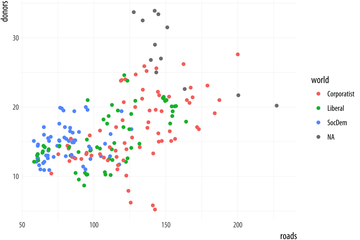 Figure 5.23: Every mapped variable has a scale.
Scales and guides are closely connected, which can make things confusing. The guide provides information about the scale, such as in a legend or colorbar. Thus, it is possible to make adjustments to guides from inside the various scale_ functions. More often it is easier to use the guides() function directly.
p <- ggplot(data = organdata,
            mapping = aes(x = roads,
                          y = donors,
                          color = world))
p + geom_point()
Figure 5.23 shows a plot with three aesthetic mappings. The variable roads is mapped to x; donors is mapped to y; and world is mapped to color. The x and y scales are both continuous, running smoothly from just under the lowest value of the variable to just over the highest value. Various labeled tick marks orient the reader to the values on each axis. The color mapping also has a scale. The world measure is an unordered categorical variable, so its scale is discrete. It takes one of four values, each represented by a different color.
Along with color, mappings like fill, shape, and size will have scales that we might want to customize or adjust. We could have mapped world to shape instead of color. In that case our four-category variable would have a scale consisting of four different shapes. Scales for these mappings may have labels, axis tick marks at particular positions, or specific colors or shapes. If we want to adjust them, we use one of the scale_ functions.
Many different kinds of variable can be mapped. More often than not x and y are continuous measures. But they might also easily be discrete, as when we mapped country names to the y axis in our boxplots and dotplots. An x or y mapping can also be defined as a transformation onto a log scale, or as a special sort of number value like a date. Similarly, a color or a fill mapping can be discrete and unordered, as with our world variable, or discrete and ordered, as with letter grades in an exam. A color or fill mapping can also be a continuous quantity, represented as a gradient running smoothly from a low to a high value. Finally, both continuous gradients and ordered discrete values might have some defined neutral midpoint with extremes diverging in both directions.
 Figure 5.24: A schema for naming the
 scale functions.
Because we have several potential mappings, and each mapping might be to one of several different scales, we end up with a lot of individual scale_ functions. Each deals with one combination of mapping and scale. They are named according to a consistent logic, shown in Figure 5.24. First comes the scale_ name, then the mapping it applies to, and finally the kind of value the scale will display. Thus, the scale_x_continuous() function controls x scales for continuous variables; scale_y_discrete() adjusts y scales for discrete variables; and scale_x_log10() transforms an x mapping to a log scale. Most of the time, ggplot will guess correctly what sort of scale is needed for your mapping. Then it will work out some default features of the scale (such as its labels and where the tick marks go). In many cases you will not need to make any scale adjustments. If x is mapped to a continuous variable then adding + scale_x_continuous() to your plot statement with no further arguments will have no effect. It is already there implicitly. Adding + scale_x_log10(), on the other hand, will transform your scale, as now you have replaced the default treatment of a continuous x variable.
If you want to adjust the labels or tick marks on a scale, you will need to know which mapping it is for and what sort of scale it is. Then you supply the arguments to the appropriate scale function. For example, we can change the x-axis of the previous plot to a log scale, and then also change the position and labels of the tick marks on the y-axis.
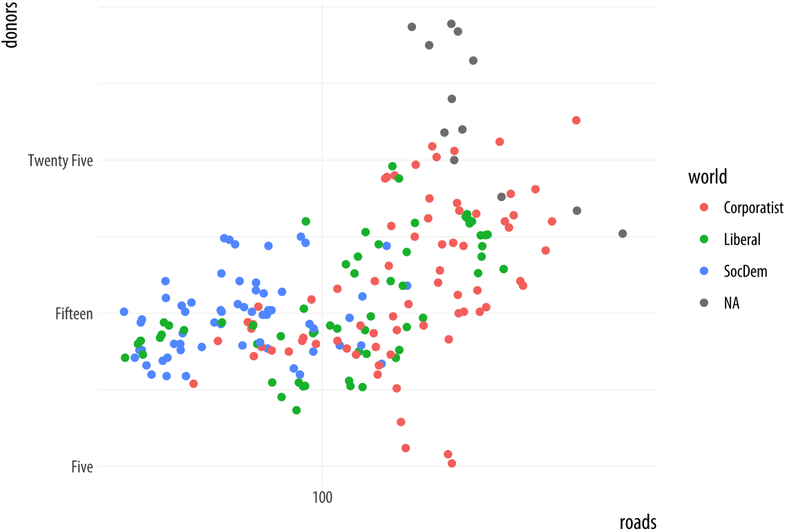 Figure 5.25: Making some scale adjustments.
p <- ggplot(data = organdata,
            mapping = aes(x = roads,
                          y = donors,
                          color = world))
p + geom_point() +
    scale_x_log10() +
    scale_y_continuous(breaks = c(5, 15, 25),
                       labels = c("Five", "Fifteen", "Twenty Five"))
The same applies to mappings like color and fill. Here the available scale_ functions include ones that deal with continuous, diverging, and discrete variables, as well as others that we will encounter later when we discuss the use of color and color palettes in more detail. When working with a scale that produces a legend, we can also use this its scale_ function to specify the labels in the key. To change the title of the legend, however, we use the labs() function, which lets us label all the mappings.
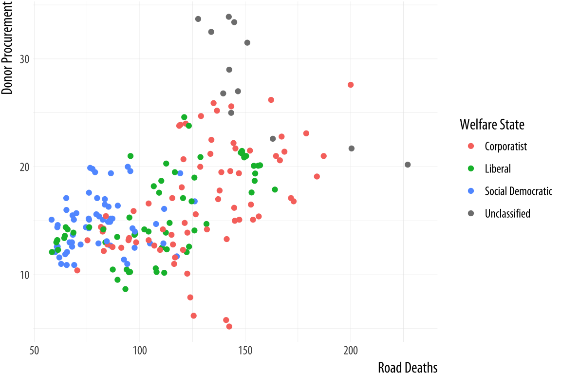 Figure 5.26: Relabeling via a scale function.
p <- ggplot(data = organdata,
            mapping = aes(x = roads,
                          y = donors,
                          color = world))
p + geom_point() +
    scale_color_discrete(labels =
                             c("Corporatist", "Liberal",
                               "Social Democratic", "Unclassified")) +
    labs(x = "Road Deaths",
         y = "Donor Procurement",
        color = "Welfare State")
If we want to move the legend somewhere else on the plot, we are making a purely cosmetic decision and that is the job of the theme() function. As we have already seen, adding + theme(legend.position = "top") will move the legend as instructed. Finally, to make the legend disappear altogether, we tell ggplot that we do not want a guide for that scale. This is generally not good practice, but there can be good reasons to do it. We will see some examples later on.
p <- ggplot(data = organdata,
            mapping = aes(x = roads,
                          y = donors,
                          color = world))
p + geom_point() +
    labs(x = "Road Deaths",
         y = "Donor Procurement") +
    guides(color = FALSE)
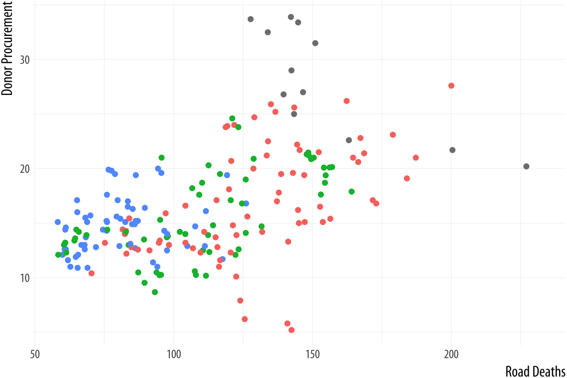 Figure 5.27: Removing the guide to a scale.
We will look more closely at scale_ and theme() functions in Chapter 8, when we discuss how to polish plots that we are ready to display or publish. Until then, we will use scale_ functions fairly regularly to make small adjustments to the labels and axes of our graphs. And we will occasionally use the theme() function to make some cosmetic adjustments here and there. So you do not need to worry too much about additional details of how they work until later on. But at this point it is worth knowing what scale_ functions are for, and the logic behind their naming scheme. Understanding the scale_<mapping>_<kind>() rule makes it easier to see what is going on when one of these functions is called to make an adjustment to a plot.
5.7 Where to go next
We covered several new functions and data aggregation techniques in this Chapter. You should practice working with them.
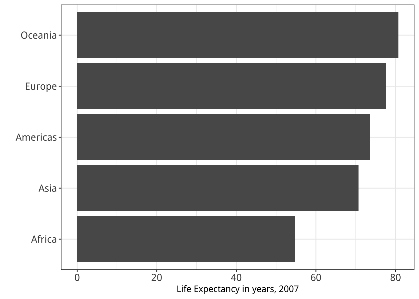
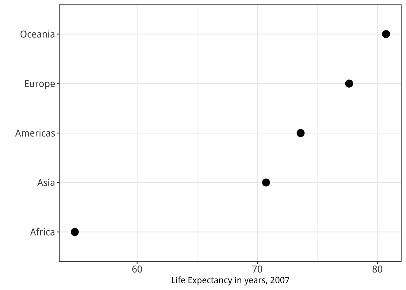 Figure 5.28: Two figures from Chapter 1.
- The
subset()function is very useful when used in conjunction with a series of layered geoms. Go back to your code for the Presidential Elections plot (Figure 5.18) and redo it so that it shows all the data points but only labels elections since 1992. You might need to look again at theelections_historicdata to see what variables are available to you. You can also experiment with subsetting by political party, or changing the colors of the points to reflect the winning party. - Use
geom_point()andreorder()to make a Cleveland dot plot of all Presidential elections, ordered by share of the popular vote. - Try using
annotate()to add a rectangle that lightly colors the entire upper left quadrant of Figure 5.18. - The main action verbs in the
dplyrlibrary aregroup_by(),filter(),select(),summarize(), andmutate(). Practice with them by revisiting thegapminderdata to see if you can reproduce a pair of graphs from Chapter One, shown here again in Figure 5.28. You will need to filter some rows, group the data by continent, and calculate the mean life expectancy by continent before beginning the plotting process. - Get comfortable with grouping, mutating, and summarizing data in pipelines. This will become a routine task as you work with your data. There are many ways that tables can be aggregated and transformed. Remember
group_by()groups your data from left to right, with the rightmost or innermost group being the level calculations will be done at;mutate()adds a column at the current level of grouping; andsummarize()aggregates to the next level up. Try creating some grouped objects from the GSS data, calculating frequencies as you learned in this Chapter, and then check to see if the totals are what you expect. For example, start by groupingdegreebyrace, like this:
gss_sm %>% group_by(race, degree) %>%
    summarize(N = n()) %>%
    mutate(pct = round(N / sum(N)*100, 0))
## # A tibble: 18 x 4
## # Groups: race [3]
## race degree N pct
## <fct> <fct> <int> <dbl>
## 1 White Lt High School 197 9.00
## 2 White High School 1057 50.0
## 3 White Junior College 166 8.00
## 4 White Bachelor 426 20.0
## 5 White Graduate 250 12.0
## 6 White <NA> 4 0
## 7 Black Lt High School 60 12.0
## 8 Black High School 292 60.0
## 9 Black Junior College 33 7.00
## 10 Black Bachelor 71 14.0
## 11 Black Graduate 31 6.00
## 12 Black <NA> 3 1.00
## 13 Other Lt High School 71 26.0
## 14 Other High School 112 40.0
## 15 Other Junior College 17 6.00
## 16 Other Bachelor 39 14.0
## 17 Other Graduate 37 13.0
## 18 Other <NA> 1 0- This code is similar to what you saw earlier, but a little more compact. (We calculate the
pctvalues directly.) Check the results are as you expect by grouping byraceand summing the percentages. Try doing the same exercise grouping bysexorregion. - Try summary calculations with functions other than
sum. Can you calculate the mean and median number of children bydegree? (Hint: thechildsvariable ingss_smhas children as a numeric value.) dplyrhas a large number of helper functions that let you summarize data in many different ways. The vignette on window functions included with thedplyrdocumentation is a good place to begin learning about these. You should also look at Chapter 3 of Wickham & Grolemund (2016) for more information on transforming data withdplyr.- Experiment with the
gapminderdata to practice some of the new geoms we have learned. Try examining population or life expectancy over time using a series of boxplots. (Hint: you may need to use thegroupaesthetic in theaes()call.) Can you facet this boxplot by continent? Is anything different if you create a tibble fromgapminderthat explicitly groups the data byyearandcontinentfirst, and then create your plots with that? - Read the help page for
geom_boxplot()and take a look at thenotchandvarwidthoptions. Try them out to see how they change the look of the plot. - As an alternative to
geom_boxplot()trygeom_violin()for a similar plot, but with a mirrored density distribution instead of a box and whiskers. geom_pointrange()is one of a family of related geoms that produce different kinds of error bars and ranges, depending on your specific needs. They includegeom_linerange(),geom_crossbar(), andgeom_errorbar(). Try them out usinggapminderororgandatato see how they differ.